Bunkie design case study by Victor Omolasoye, Brand Designer & UI/UX Specialist —
Brand Identity & Design System
Overview
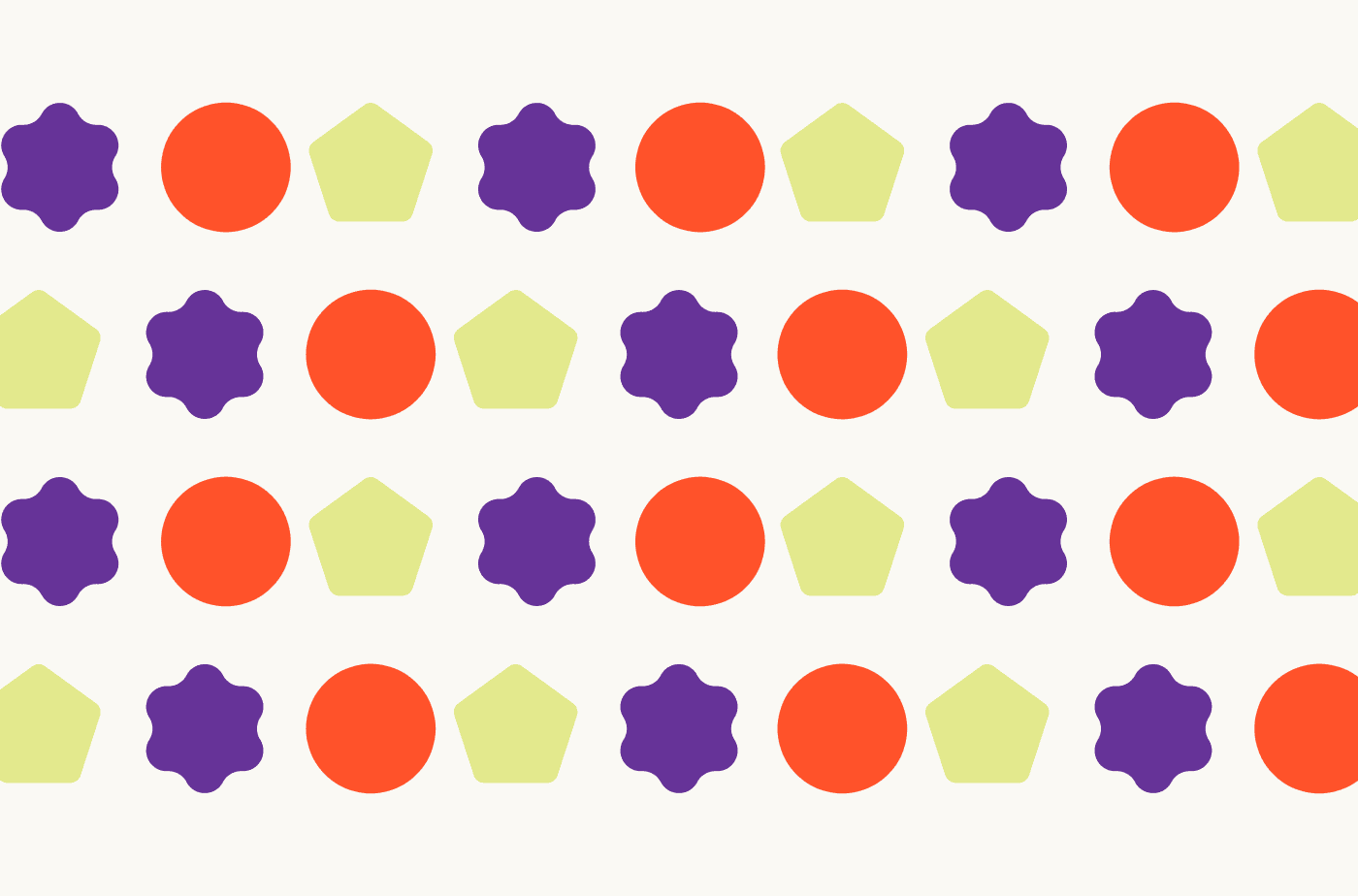
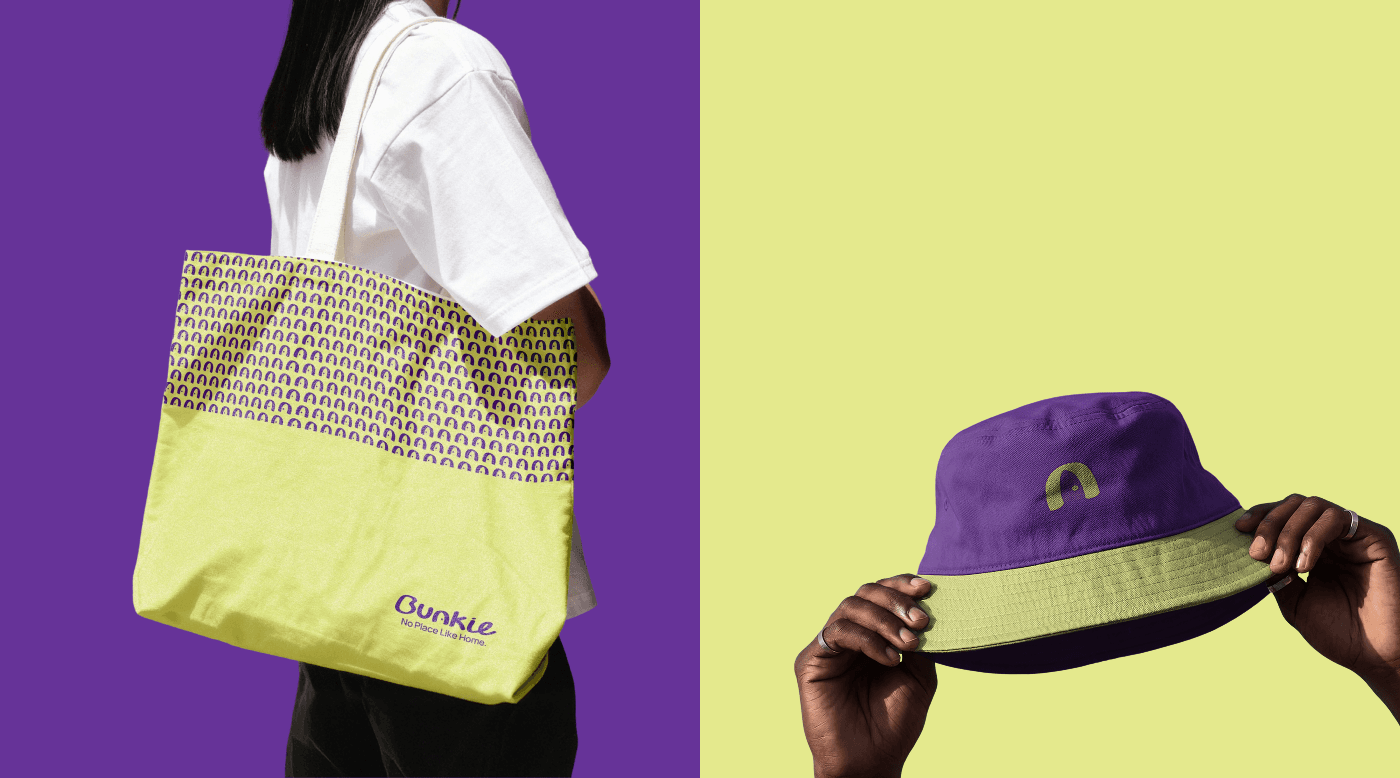
The objective was to create a cohesive, scalable brand identity and design system from the ground up. The goal was to translate brand values into a unified visual language, ensuring consistency across digital and print touchpoints through an accessible set of brand guidelines.
The Problem
Without a unified brand identity, cross-platform assets often suffer from inconsistent typography, mismatched color palettes, and fragmented messaging. The key challenges were: - Developing a distinct logo and visual mark that communicates the core ethos. - Establishing an accessible color hierarchy and robust typography system. - Creating clear guidelines to ensure seamless implementation for design and development teams.
The Solution
Delivered a complete brand identity system built on a distinct logo suite, an accessible color palette with WCAG AA contrast compliance, a robust typography hierarchy, and structured brand guidelines. A shared component library and single source of truth for brand assets ensure consistent implementation across digital and print touchpoints.
Target & Reach
Audience
- Design Teams
- Development Teams
- Marketing & Brand Teams
Regions
- Nigeria
Key Features
Logo Suite
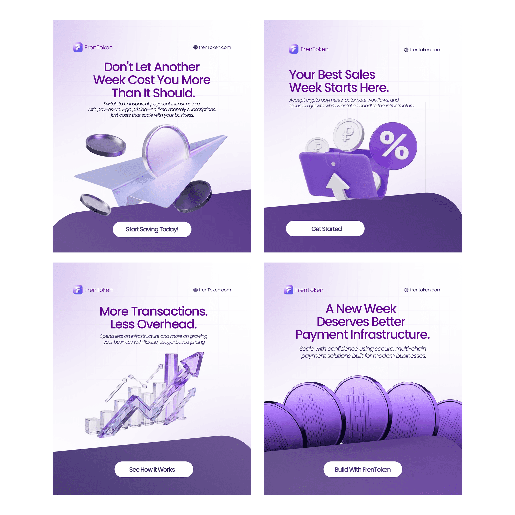
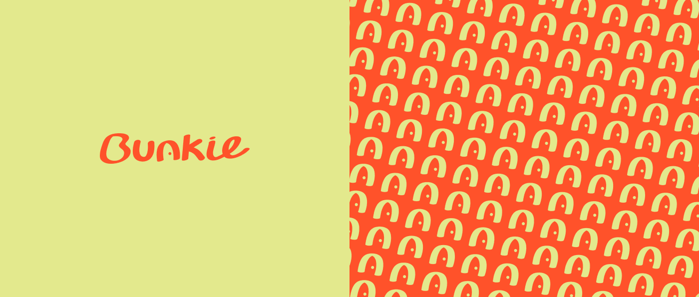
Primary logo, secondary mark, app icon, and clear-space specifications for adaptability across light/dark themes and varying screen sizes.
Color Palette
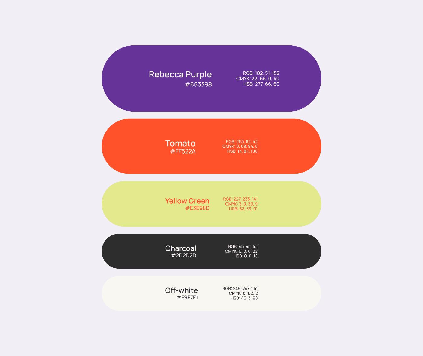
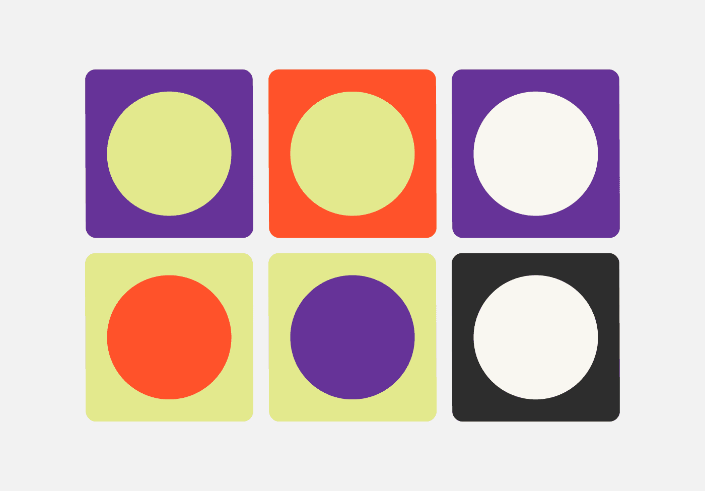
Primary brand colors, functional UI colors, and background tones supporting visual hierarchy and WCAG AA contrast compliance.
Typography System
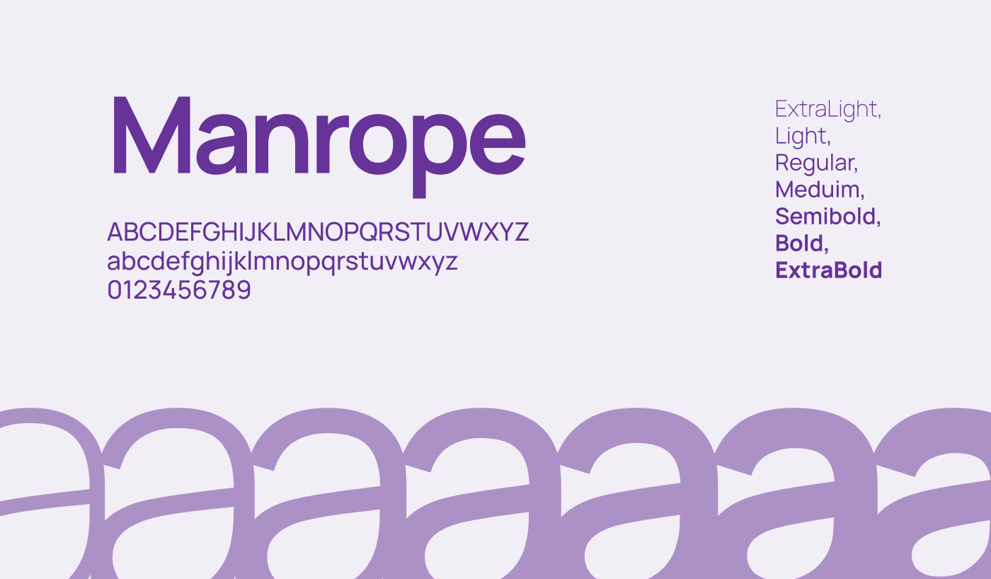
Display/heading scale, body text styles, and button/label styles ensuring consistent vertical rhythm and clear visual hierarchy.
Brand Rules
Incorrect usage examples, photographic guidelines, and tone of voice for long-term consistency across internal teams and vendors.
Technology Stack
Architecture
Results
Single Source of Truth
Efficiency
Streamlined the design-to-development workflow by centralizing all brand assets
100% Alignment
Consistency
Visual alignment across social media assets, digital product UI, and collateral
Flexible System
Scalability
Built to expand alongside future product lines and marketing campaigns
Screens Gallery


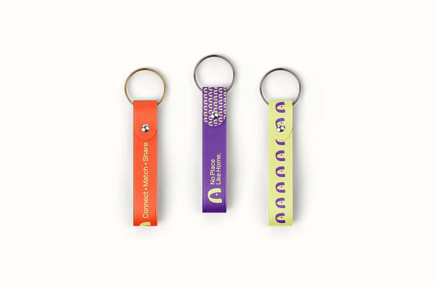

Executive Summary
Role: Brand Designer & UI/UX Specialist
Deliverables: Brand Strategy, Visual Identity System, Brand Guidelines Document, Component Library
Tools Used: Figma, Adobe Illustrator
Process & Approach
Step 1: Research & Discovery
Brand Audit & Strategy: Analyzed market positioning, target audience demographics, and competitor branding to define visual tone and personality keywords.
Moodboarding: Explored visual directions focusing on modern aesthetics, legibility, and geometric balance.
Step 2: Visual Identity Development
Logo & Mark: Iterated on primary logo formats, iconography, and clear-space rules to maintain visual integrity across different screen sizes and print formats.
Color System: Defined primary, secondary, and neutral palettes with strict accessibility contrast ratios (WCAG compliance) for digital applications.
Typography Hierarchy: Selected versatile typeface pairings for headlines, body copy, and UI components to ensure readability across devices.
Step 3: Guidelines & Systems Design
Built a structured Brand Guidelines document covering logo usage, color codes (HEX, RGB, CMYK), typography scales, icon sets, and explicit imagery do's and don'ts.
Key Deliverables & System Features
| Asset Category | Components Included | Core Purpose |
|---|---|---|
| Logo Suite | Primary logo, secondary mark, app icon, clear-space specifications | Adaptability across light/dark themes and varying screen sizes |
| Color Palette | Primary brand colors, functional UI colors, background tones | Visual hierarchy and WCAG AA contrast compliance |
| Typography | Display/Heading scale, body text styles, button/label styles | Consistent vertical rhythm and clear visual hierarchy |
| Brand Rules | Incorrect usage examples, photographic guidelines, tone of voice | Long-term consistency for internal teams and vendors |
Impact & Results
- Efficiency: Streamlined the design-to-development workflow by providing a single source of truth for all brand assets.
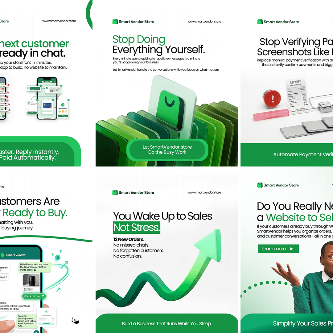
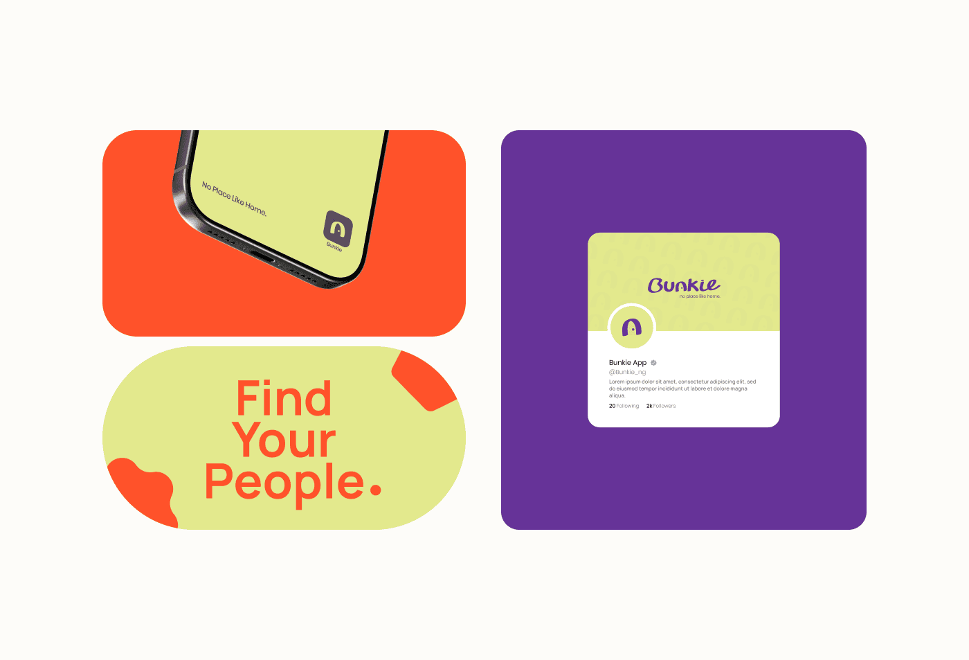
- Consistency: Ensured 100% visual alignment across social media assets, digital product UI, and collateral.
- Scalability: Built a flexible system capable of expanding alongside future product lines and marketing campaigns.