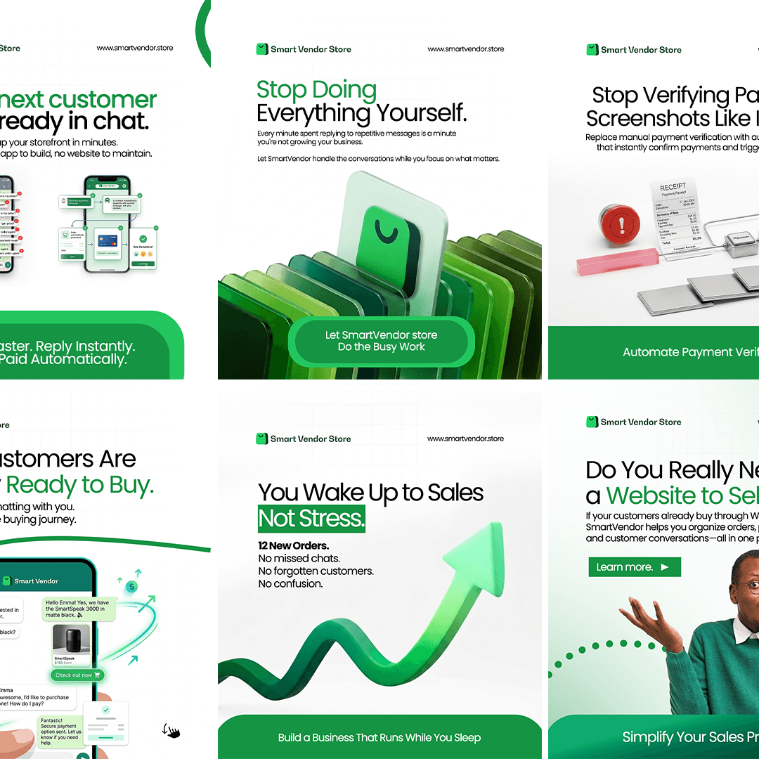
FrenToken Campaign design case study by Victor Omolasoye, Visual & Brand Designer —
Optimizing B2B Web3 Payment Marketing
Overview
A cohesive, 4-part social media campaign designed for FrenToken to target business owners and developers at the start of the work week. The graphics translate complex Web3 infrastructure into digestible, high-converting B2B value propositions.
The Problem
Web3 and crypto payment solutions often suffer from marketing that is either overly technical or visually cluttered with chaotic 'cyberpunk' tropes. The challenge was to position FrenToken as a premium, trustworthy SaaS platform rather than just another volatile crypto token.
The Solution
Move away from cluttered crypto tropes to position FrenToken as a premium, trustworthy SaaS platform. A strict component framework was established with top-aligned branding, mid-tier custom 3D art, and bottom-anchored CTA waves to keep the campaign visually cohesive while swapping out marketing angles seamlessly.
Target & Reach
Audience
- Business Owners
- Developers
- Web3 Professionals
- B2B Decision Makers
Regions
- Global
Key Features
Color Strategy & Brand Unity
Monochromatic Block: Using a premium purple-centric palette establishes immediate brand recognition in busy feeds. Functional Gradient: A crisp light-to-dark purple gradient keeps the text highly readable while grounding the composition.
Typography & Grid Structure
Dynamic Contrast: Paired a bold, tight-tracked geometric sans-serif for high-impact headers with an elegant, lighter italicized body font for scannability. The 'Infrastructure' Grid: Faint background grid lines subtly reinforce the concept of 'building' and 'data stability' without creating visual noise.
Layout Architecture
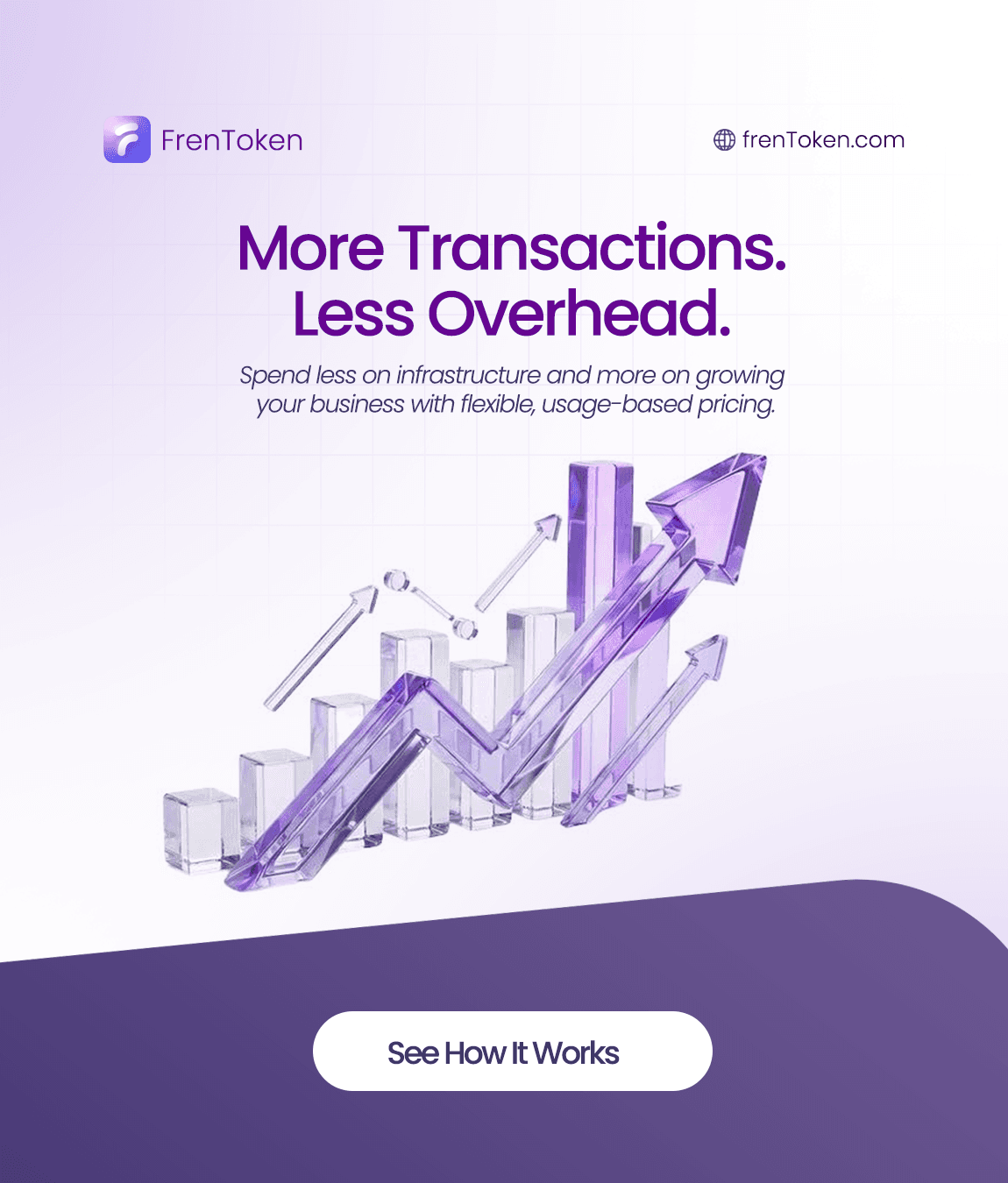
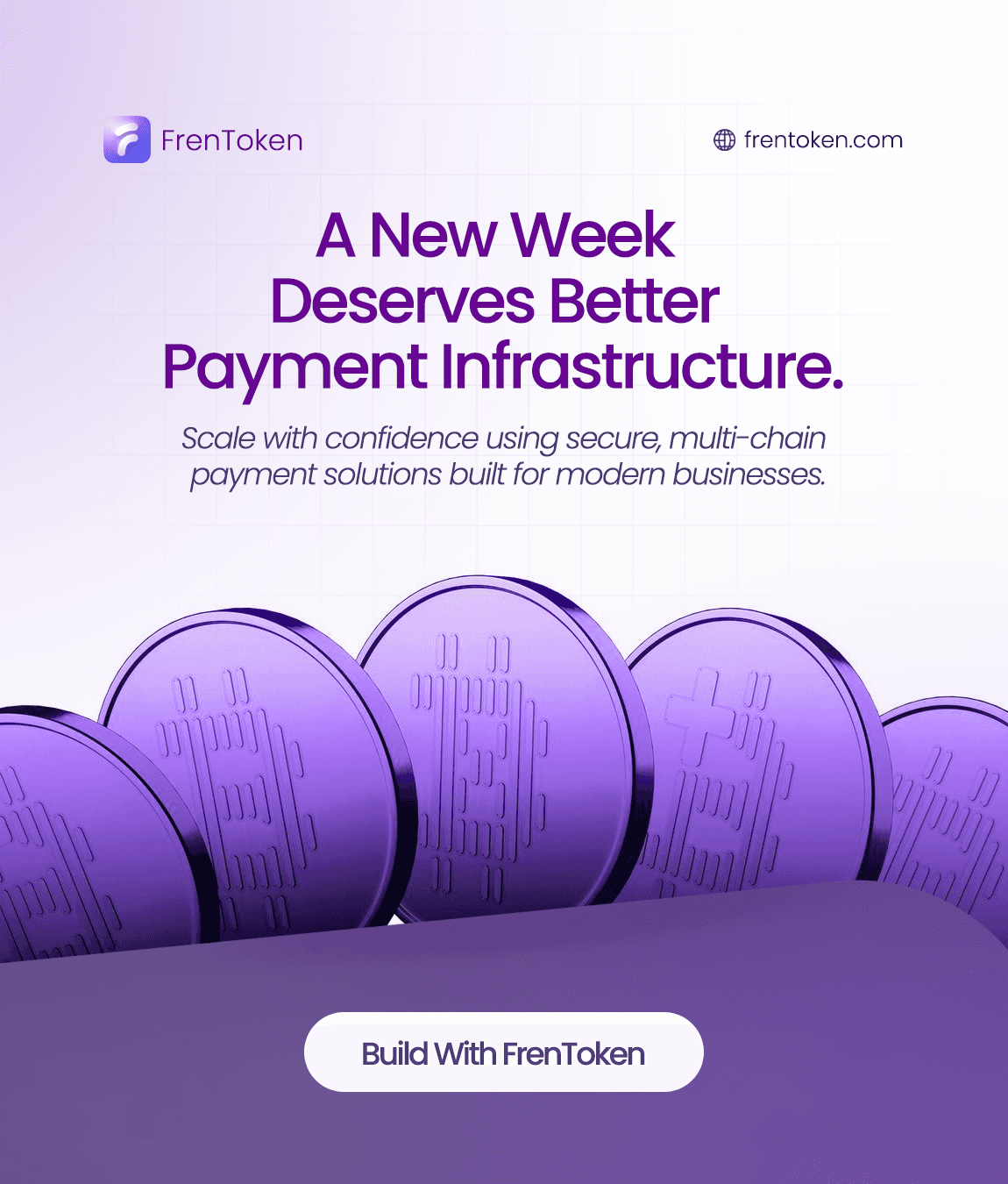
Organic Anchors: Asymmetrical dark waves at the bottom break up the rigid grid layout and naturally funnel the user's eye down. High-Contrast CTAs: Placing isolated white pill buttons directly onto the darkest part of the design creates an instant, high-converting focal point.
Technology Stack
Architecture
Results
4
Deliverables
Multi-platform social graphics
New Work Week
Campaign Theme
Targeted at business owners and developers
Template-Driven
Visual System
Top branding, mid-tier 3D art, bottom wave CTAs
Screens Gallery


Asset Breakdown
- 01. Scalability: Features solid 3D purple coins emerging from the horizon. Design Intent: Visualizes safety, depth, and strong multi-chain foundations.
- 02. ROI/Pricing: Uses a transparent glass bar chart with rising arrows. Design Intent: Simplifies 'pay-as-you-go' scaling through an easily understood corporate growth metaphor.
- 03. Efficiency: Shows currency icons dropping smoothly into a digital wallet. Design Intent: Represents automated workflows and effortless revenue collection.
- 04. Cost Savings: Positions a metallic paper airplane carrying floating tokens. Design Intent: Conveys lightness, speed, and shedding unnecessary monthly subscription weight.
The Takeaway
By establishing a strict component framework (top-aligned branding, mid-tier custom 3D art, bottom-anchored CTA waves), the campaign remains visually cohesive while swapping out marketing angles seamlessly.