NexaBank design case study by Victor Omolasoye, Lead Product Designer (UX/UI) —
Redefining Mobile Digital Banking
Overview
NexaBank is a comprehensive digital banking solution designed to streamline daily financial transactions, card management, and wealth tracking for modern users. The goal was to build a secure, unified financial ecosystem that feels intuitive, quick, and engaging.
The Problem
Traditional banking apps often overwhelm users with cluttered dashboards, complex verification hoops, and fragmented transfer processes. Onboarding friction causes user drop-off during multi-step KYC, dashboard anxiety makes financial data difficult to parse, and transaction navigation requires too many taps for common tasks.
The Solution
A modern digital banking app with minimalist onboarding flows, a modular dashboard prioritizing account balances and quick-action shortcuts, interactive card carousels for virtual card management, and integrated geolocation features for finding nearby ATMs and banking agents. Every flow was designed to reduce cognitive load and tap count.
Target & Reach
Audience
- Freelancers
- Young Professionals
- Digital Nomads
- Tech-savvy Banking Users
Regions
- Global
Key Features
Secure Authentication & Onboarding
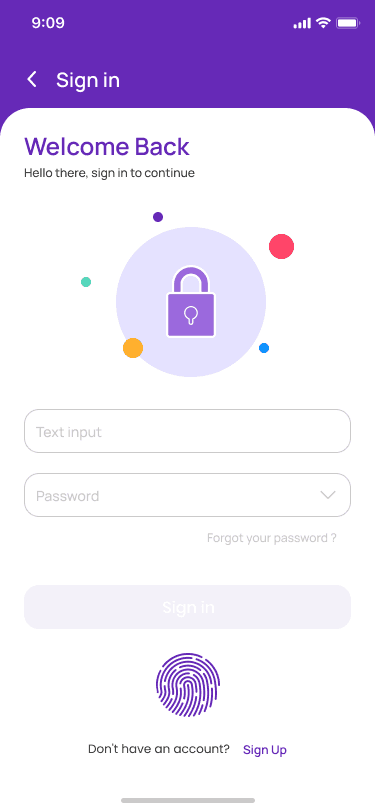
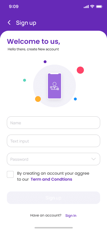
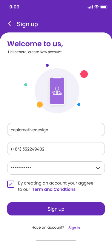
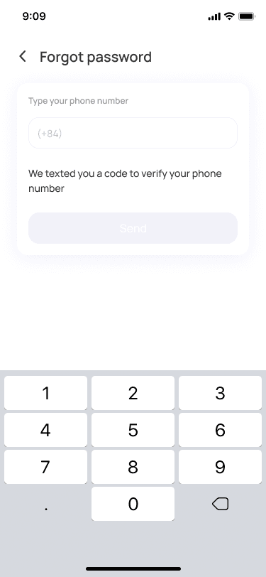
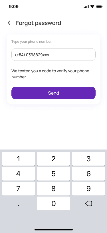
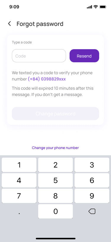
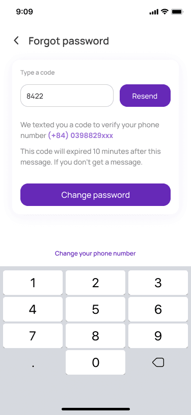
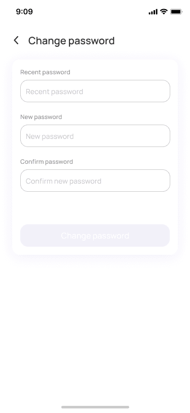
Clean phone/email verification inputs, secure PIN pads, and biometric opt-in flows that guarantee a quick gateway into the app with transparent security messaging.
Unified Wallet Dashboard
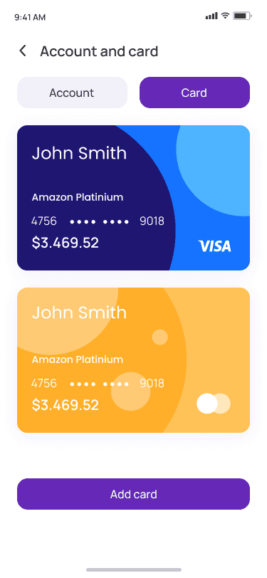
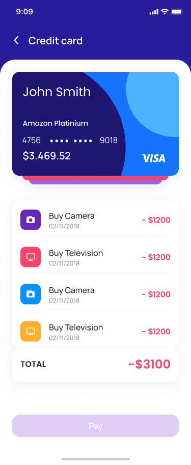
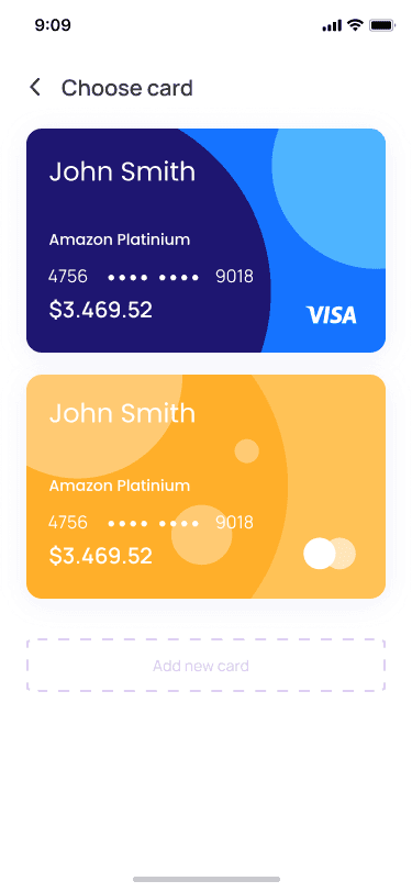
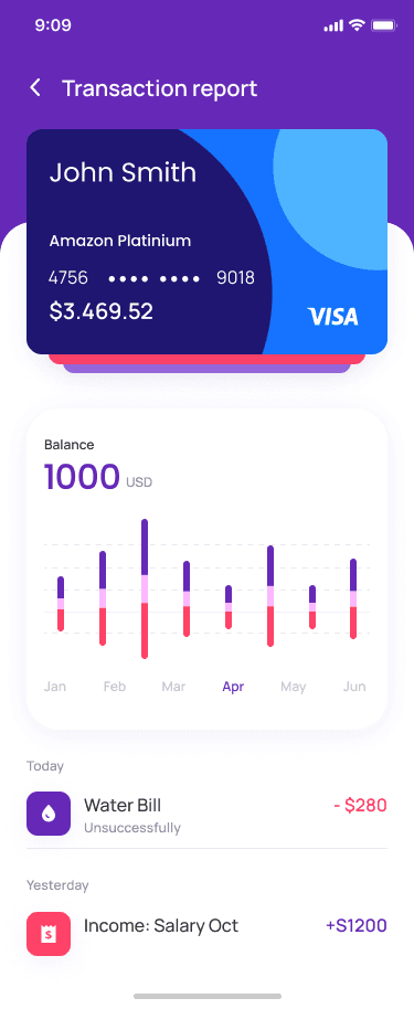
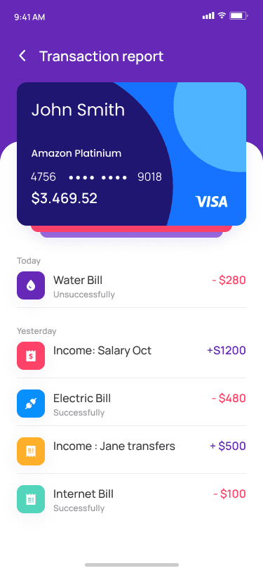
Dynamic digital debit card overlay with slide-through virtual cards, recent transactional itemizations in clean rows, and a prominent bottom navigation bar.
Seamless Money Transfers
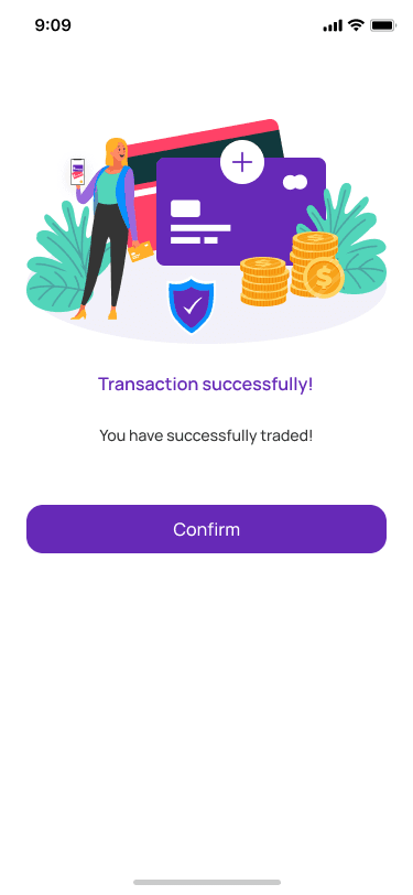
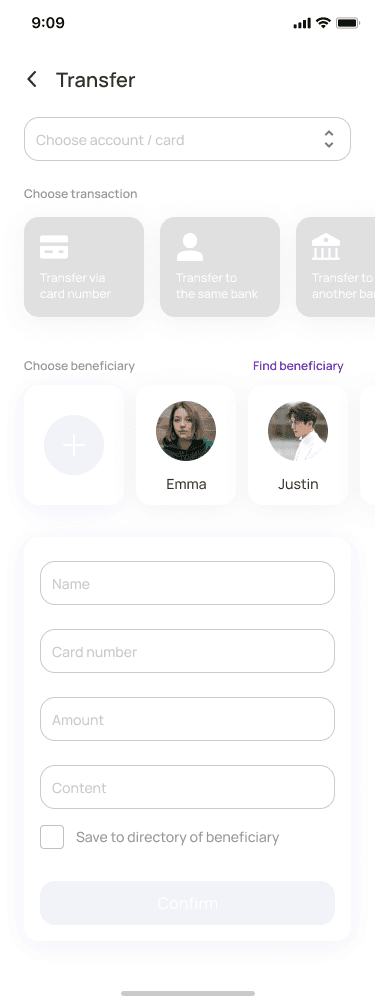
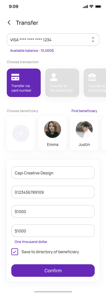
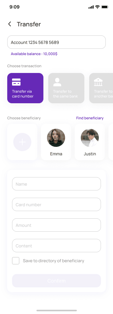
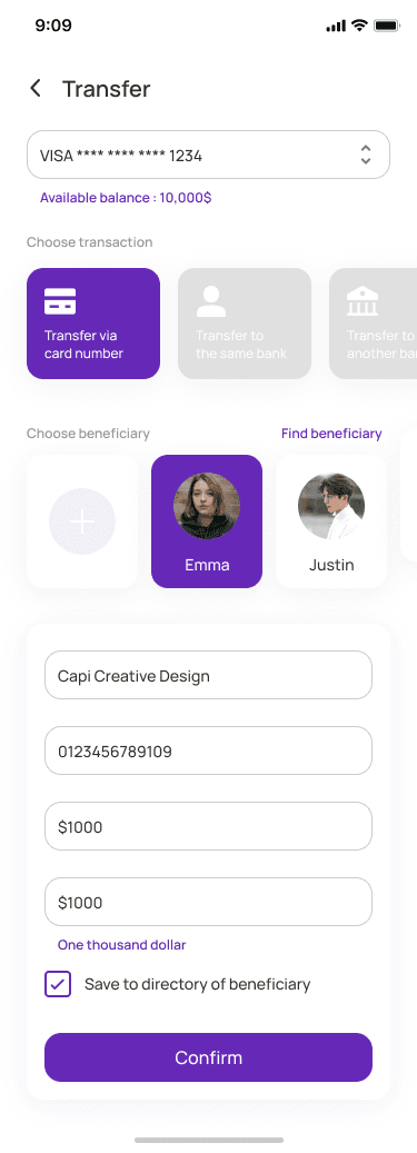
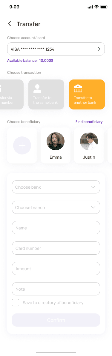
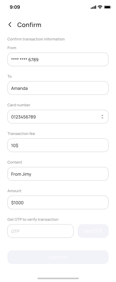
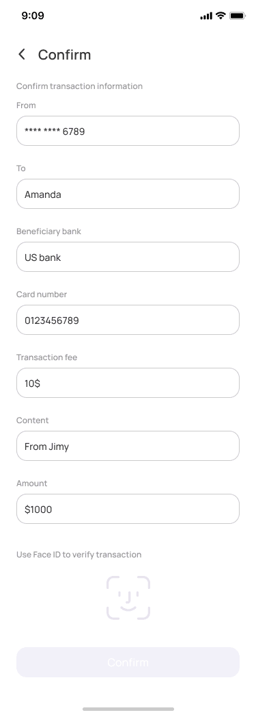
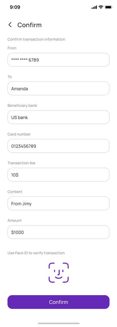
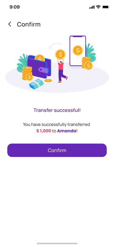
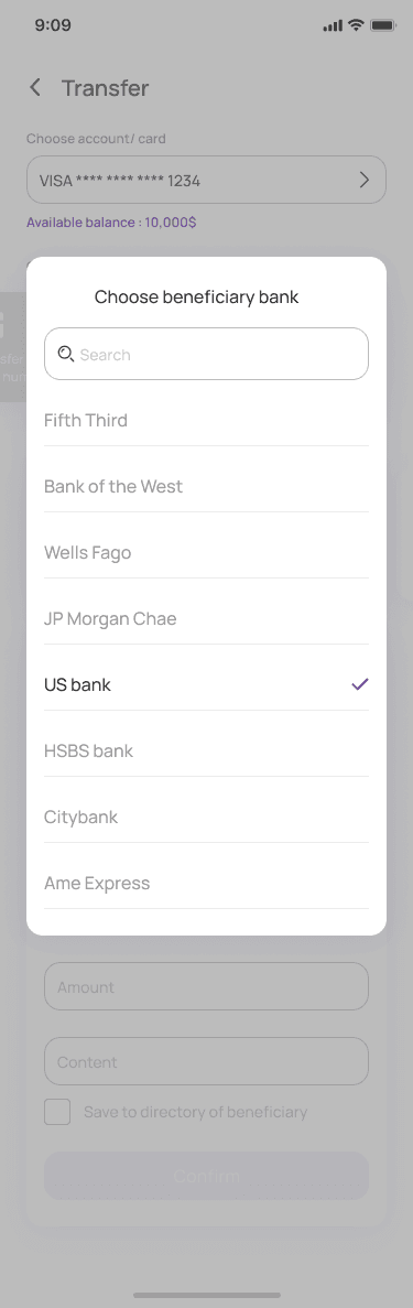
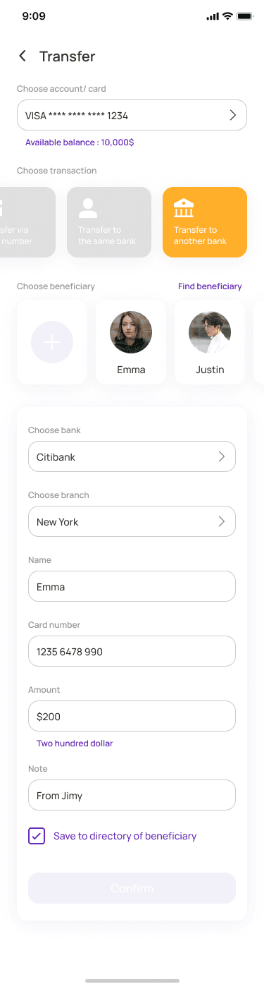
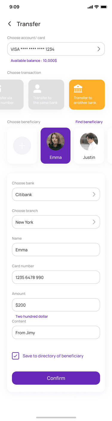
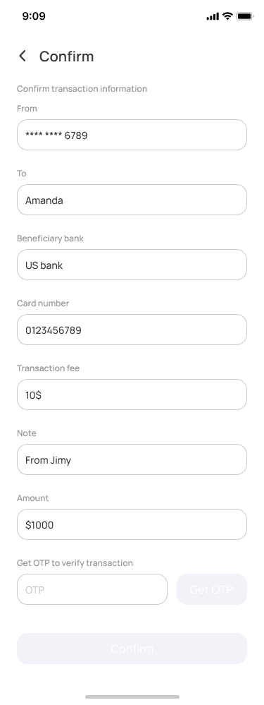
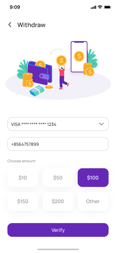
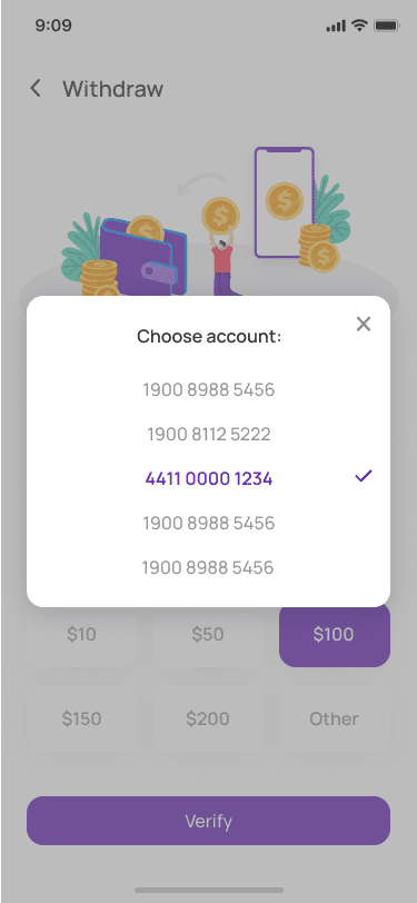
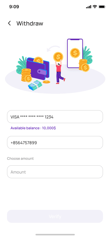
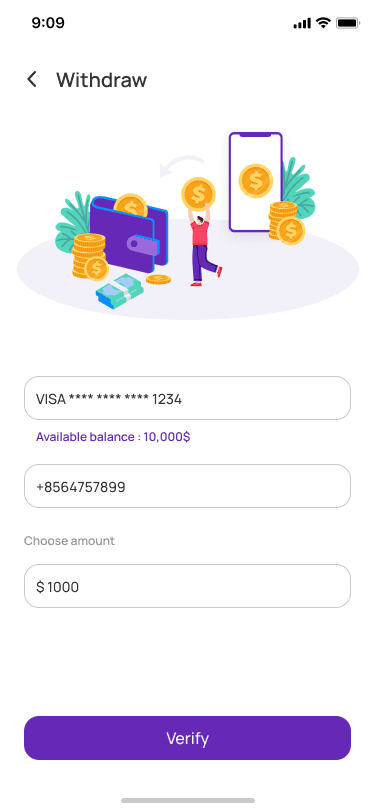
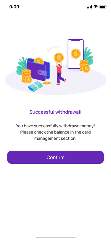
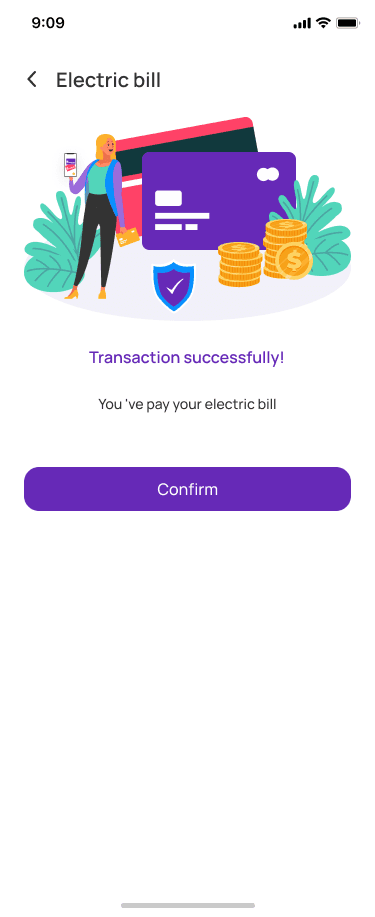
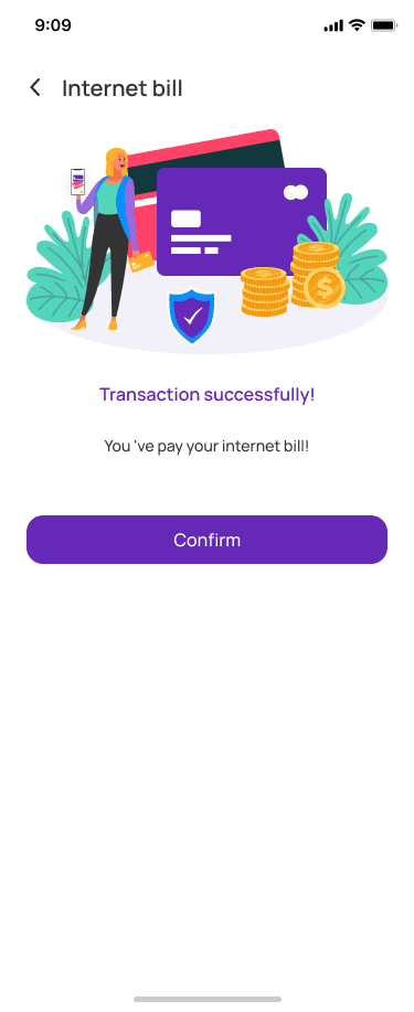
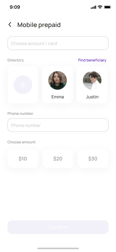
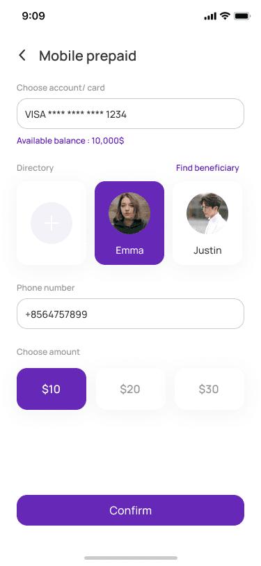
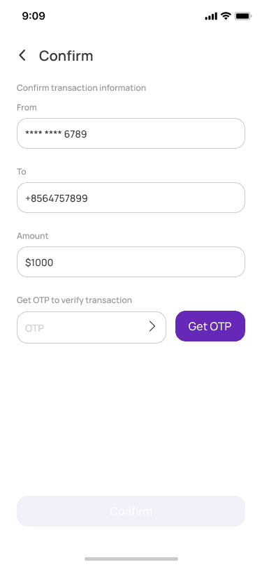
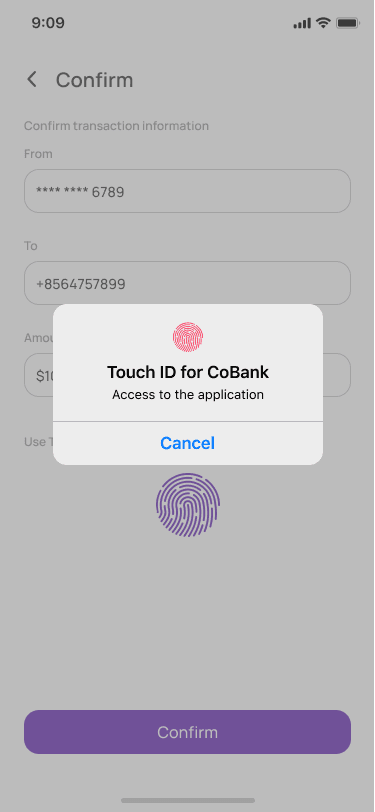
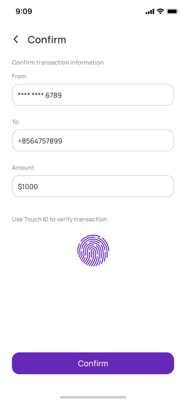
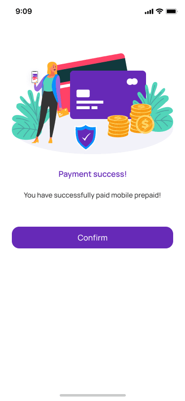
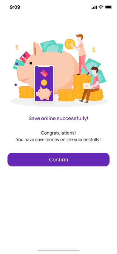
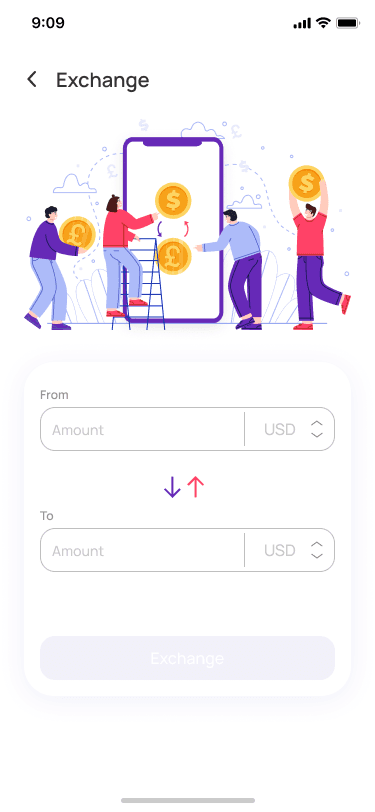
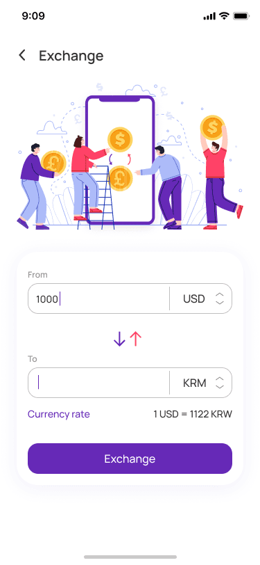
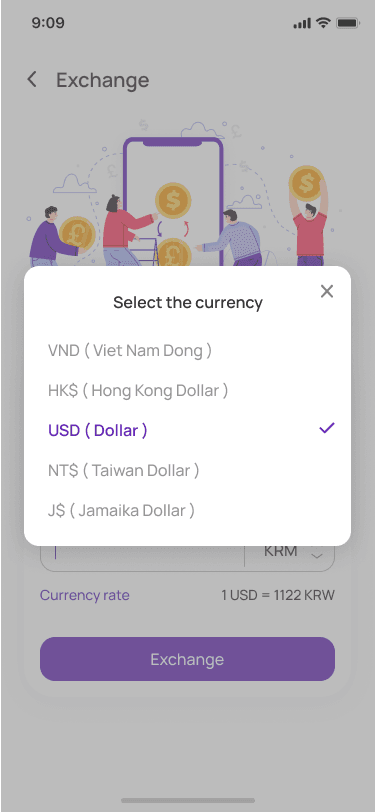
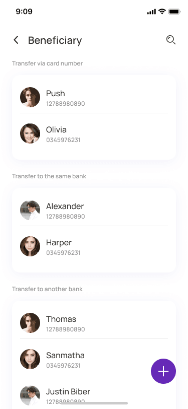
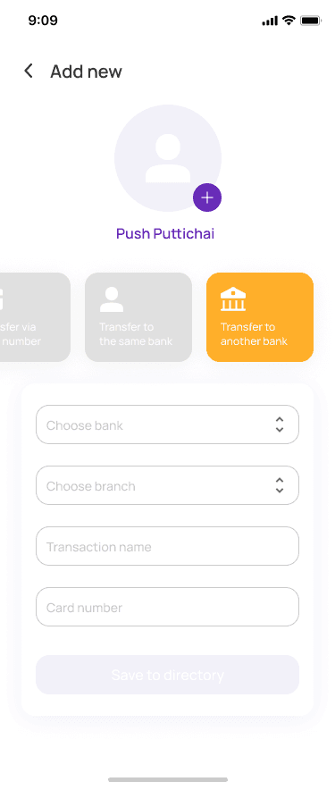
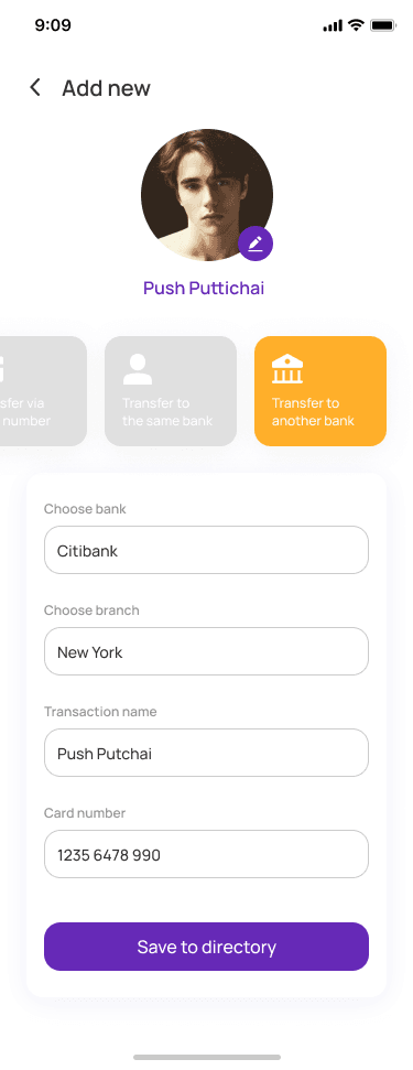
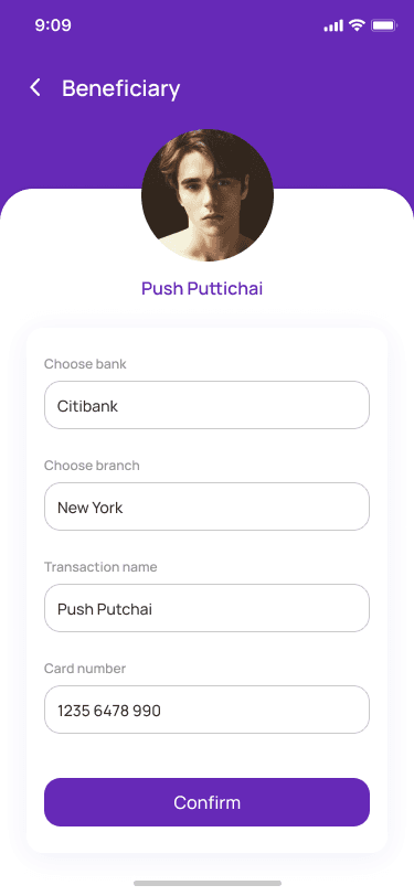
Isolated transaction menus with intuitive input fields for transfer amounts, beneficiary directories, and full confirmation flows with success states.
Geolocation & Map Utilities
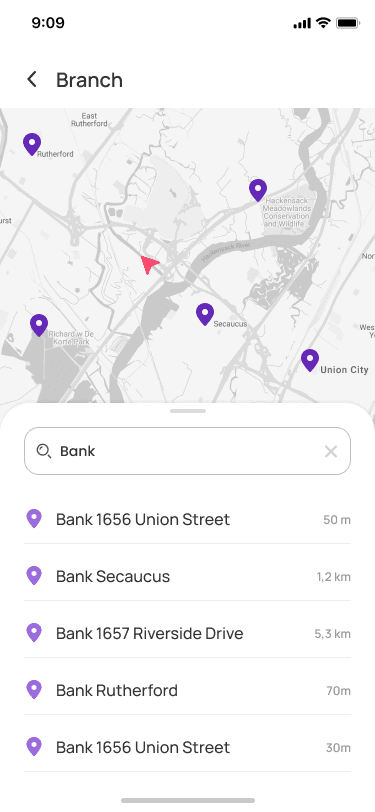
Fully integrated map view that visualizes financial touchpoints, nearby ATMs, banking agents, and localized banking perks geographically.
Bill Payments & Recharges
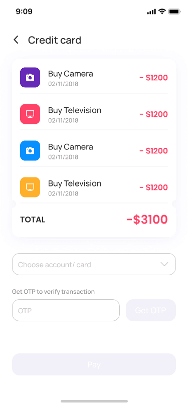
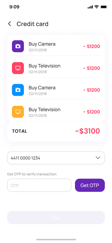
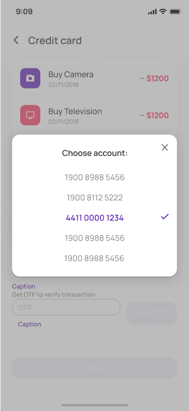
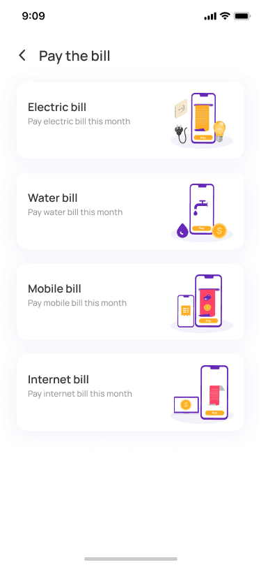
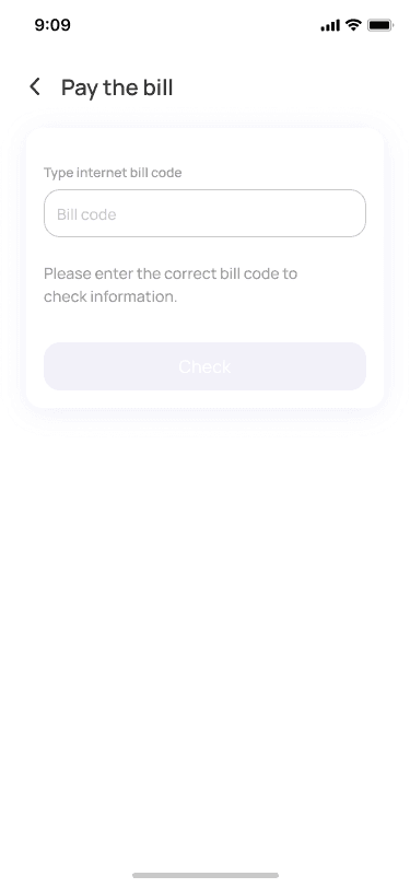
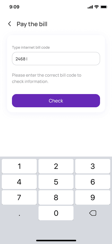
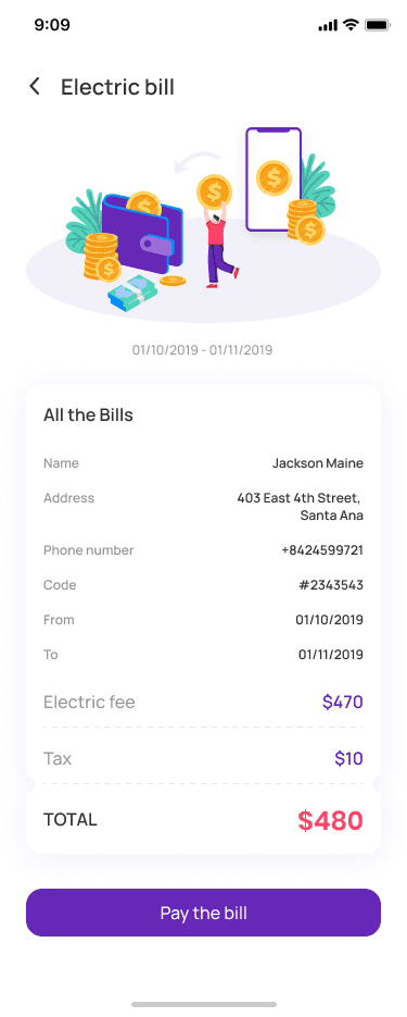
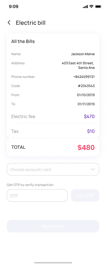
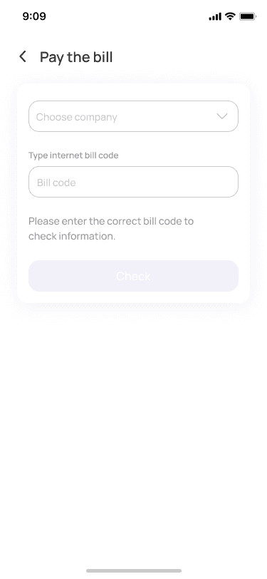
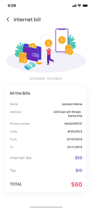
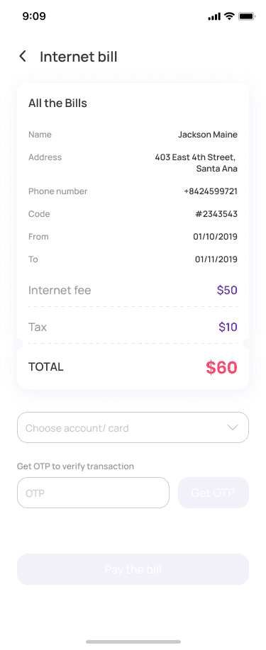
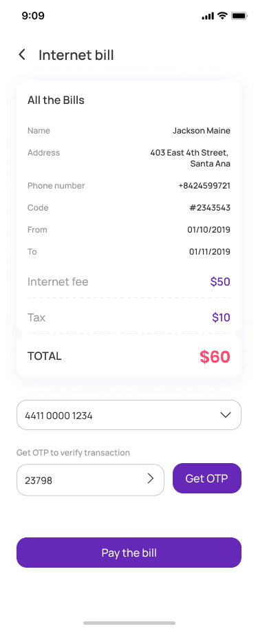
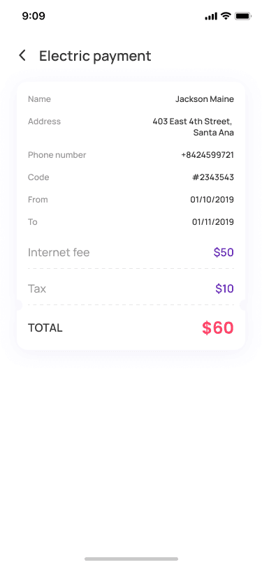
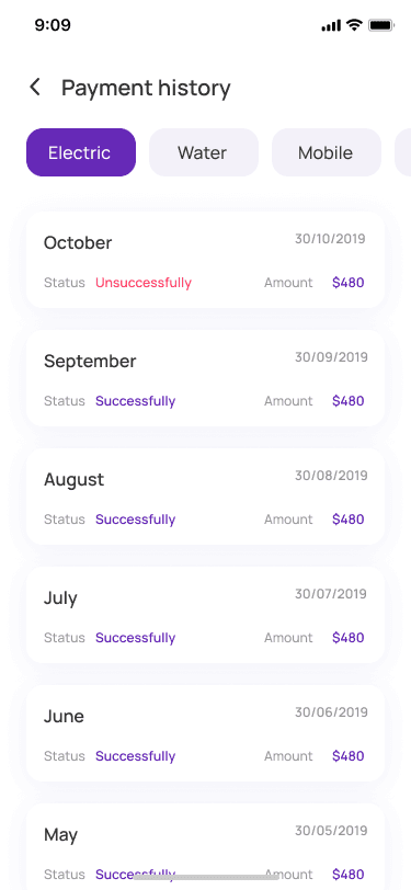
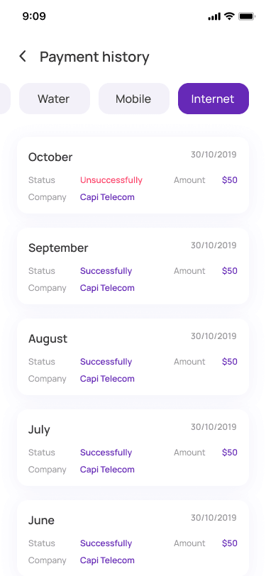
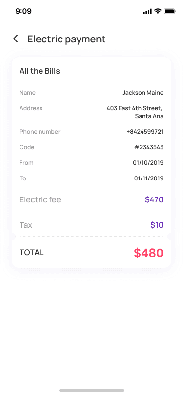
Comprehensive bill payment system covering electricity, internet, and mobile recharge with multi-step confirmation and payment history tracking.
Virtual Card Management
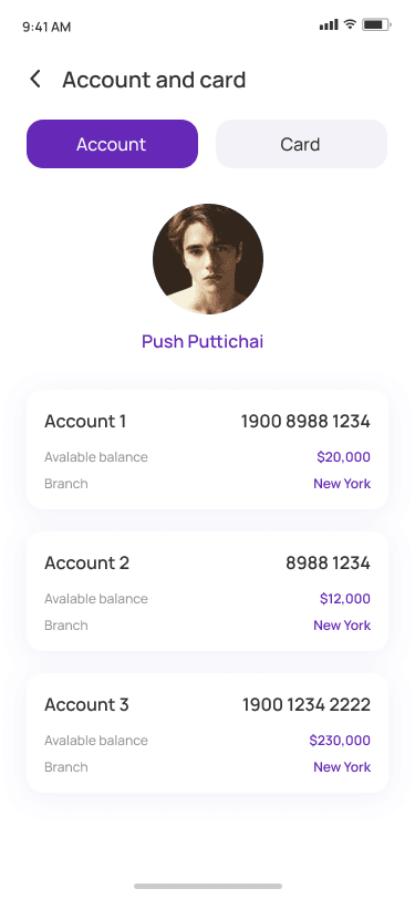
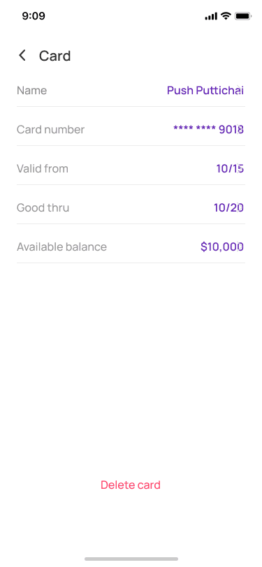
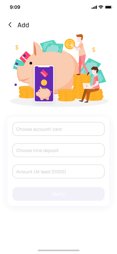
Full lifecycle management for virtual spend cards including card details, credit card views, account linking, and card-specific settings.
Technology Stack
Architecture
Modular Screen Architecture with Consistent Design Language
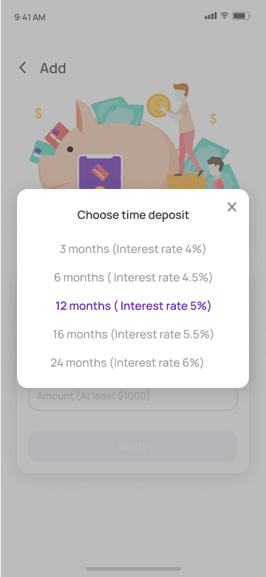
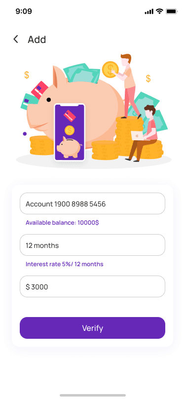
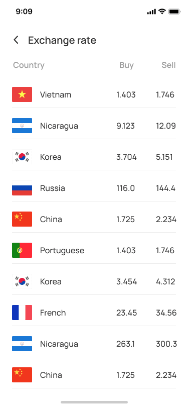
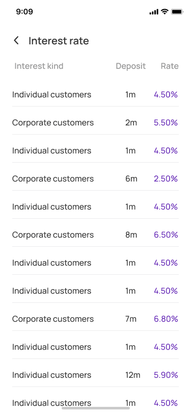
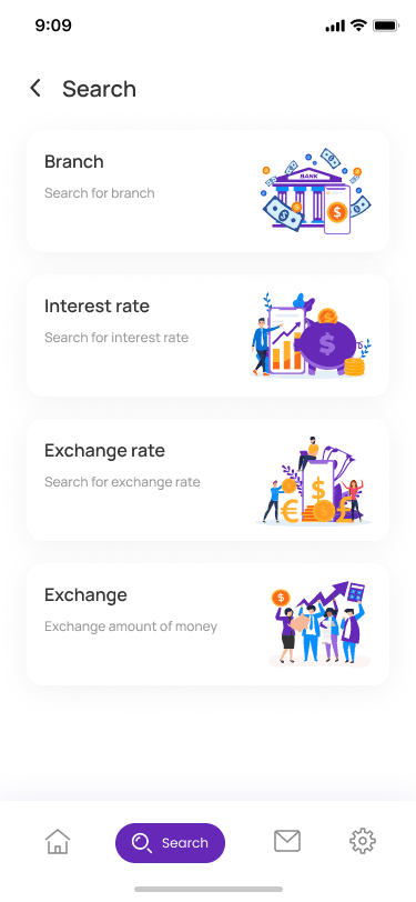
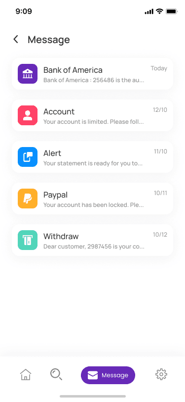
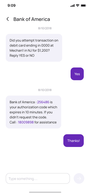
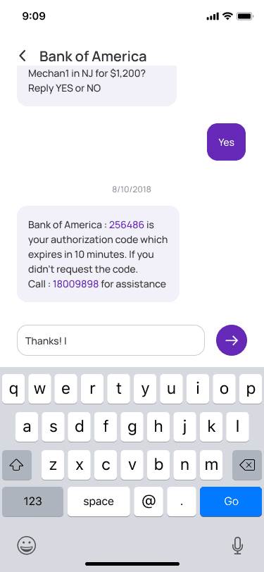
The product architecture was mapped to ensure seamless transitions across critical flows. A cohesive design system with purple primary, orange/blue accents, and geometric sans-serif typography was applied across all 89 screens to maintain visual consistency and user trust.
- Minimalist stepper components and transparent security messaging for KYC completion
- Modular dashboard grid prioritizing account balances and quick-action shortcuts
- Interactive card carousels for virtual card browsing and management
- Integrated map view for geolocation-based banking services
- Over 80 unique screens covering the full banking lifecycle
Results
+88%
Onboarding Completion
Increase due to clearer KYC progress indicators
-35%
Transfer Time
Reduction in average time to initiate and complete P2P transfers
89
Screens Designed
Comprehensive screen library covering all banking flows
Positive
User Feedback
High praise for purple accent against clean white UI backgrounds
Screens Gallery
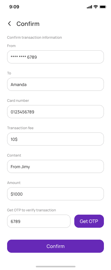
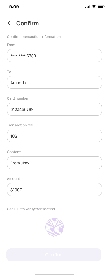
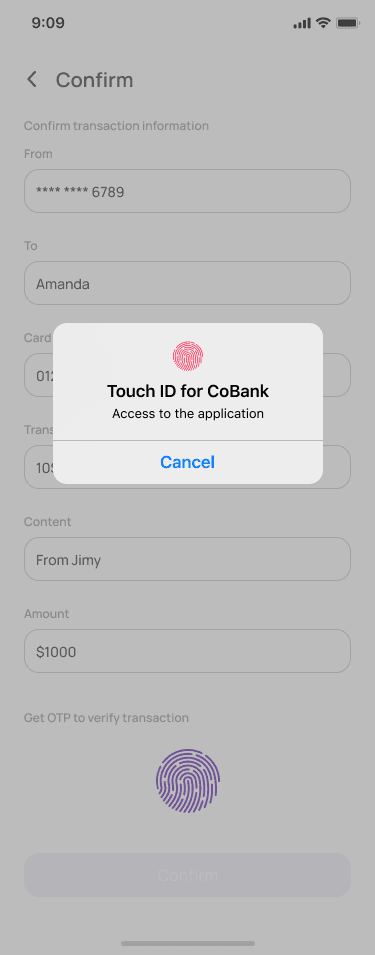
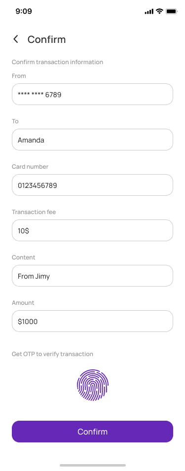
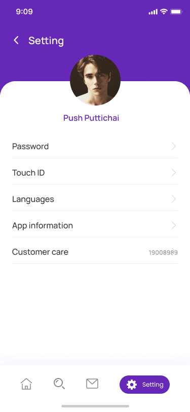
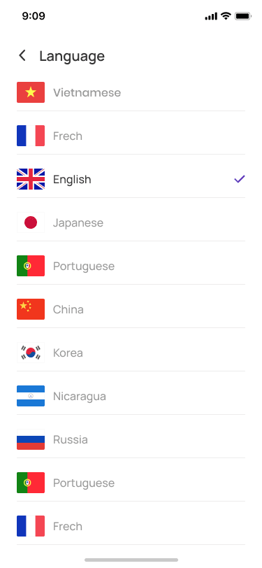
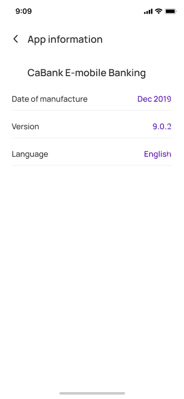
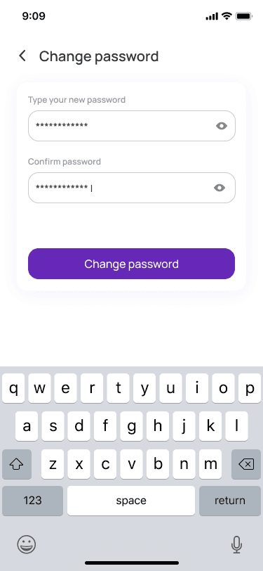
Research & Discovery
Through user interviews and competitive analysis of top fintech apps, three primary pain points were uncovered: Onboarding Friction — Users drop off during multi-step identity verification (KYC). Dashboard Anxiety — Users find financial data dense and difficult to parse at a glance. Transaction Navigation — Sending money or managing virtual cards often requires too many taps.
User Persona
Meet Alex, 28 (Freelance Digital Marketer). 'I need an app where I can manage my virtual spend cards instantly, split bills with friends, and see exactly where my money is without navigating a maze.'
Visual Design System
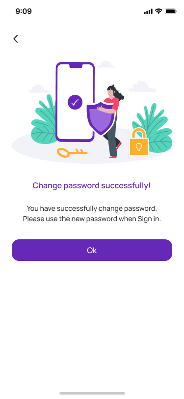
To build user trust while remaining modern, a deliberate and cohesive design language was established. Typography: Clean, geometric sans-serif for high readability across varying mobile screen densities. Color Palette: Primary Purple evokes a sense of security, modern technology, and premium service. Accent Orange/Blue used strategically for CTAs, card varieties, and financial alerts. Illustrations & Micro-interactions: Playful, vector-style spot illustrations used during loading screens, success states, and empty states to alleviate financial anxiety.
Testing & Outcomes
Usability testing on high-fidelity prototypes yielded excellent qualitative and quantitative data. 88% Increase in onboarding completion rates due to clearer KYC progress indicators. 35% Reduction in the average time it takes for a user to initiate and complete a peer-to-peer money transfer. Positive Feedback regarding the clean contrast of the purple accent against white UI backgrounds.