
Gabbstickk case study by Victor Omolasoye, Brand Designer —
Visual Brand Guidelines
A brand identity case study
Brand Designer
Nov 2026
A photography brand built on feeling
The goal was not another camera logo. It was a visual identity that could hold emotion, memory and craft in one quiet system.
Gabbstickk Visuals photographs people, events and brand stories. The studio wanted an identity that felt as considered as its frames, warm enough for intimate portraits and confident enough for commercial work.
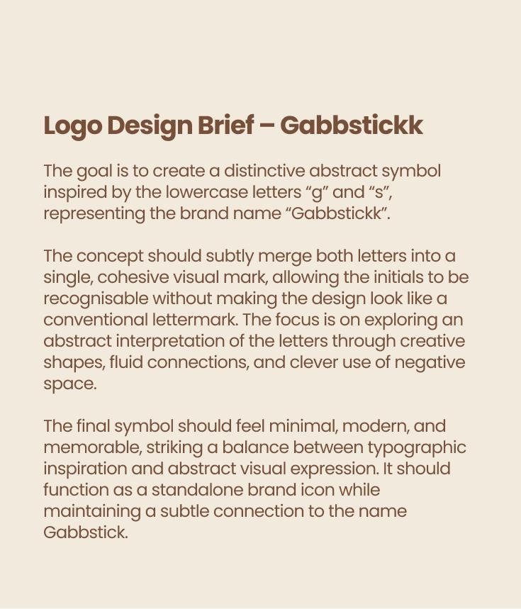
The work began with the logomark. The brief asked for an abstract symbol inspired by the lowercase letters "g" and "s", merged into one cohesive form so the initials stayed recognisable without becoming a conventional lettermark.
That mark became the anchor for everything else: a warm earth palette, an editorial type hierarchy, a logo-led pattern and a clear set of photography and application rules.
The idea
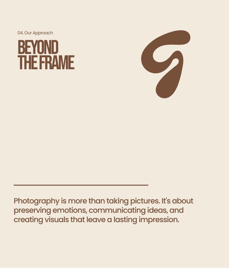
Photography is more than taking pictures. It is about preserving emotions, communicating ideas and creating visuals that leave a lasting impression.
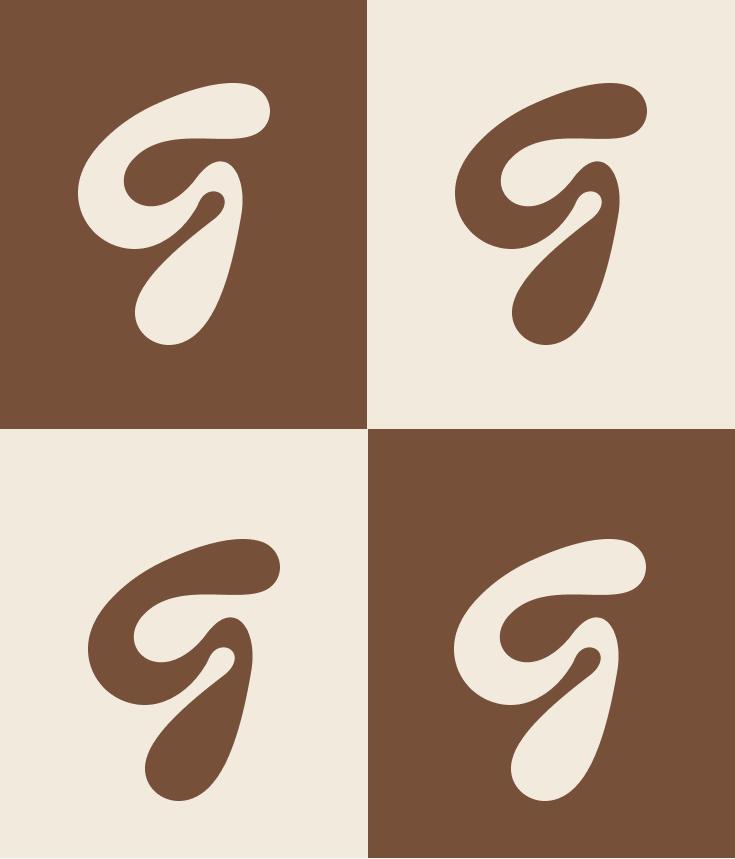
One mark, many moods
A single organic shape carries the initials, then adapts across fill, outline, lockup and crop without losing its character.
The logomark is drawn as one continuous, fluid form. The rounded upper stroke resolves into the lowercase g, while the lower teardrop completes the s, with negative space doing the work of separating the two letters.
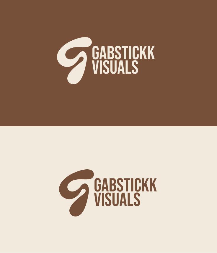
Because the shape is simple, it holds up at every scale. It sits confidently as a standalone icon, locks up beside the Gabbstickk Visuals wordmark, or gets cropped off the edge of a layout as a graphic device.
The identity also defines clear colour behaviour: cream on chestnut, chestnut on cream, and reversed treatments for photography, so the mark never competes with the image it sits on.




A warm, grounded palette
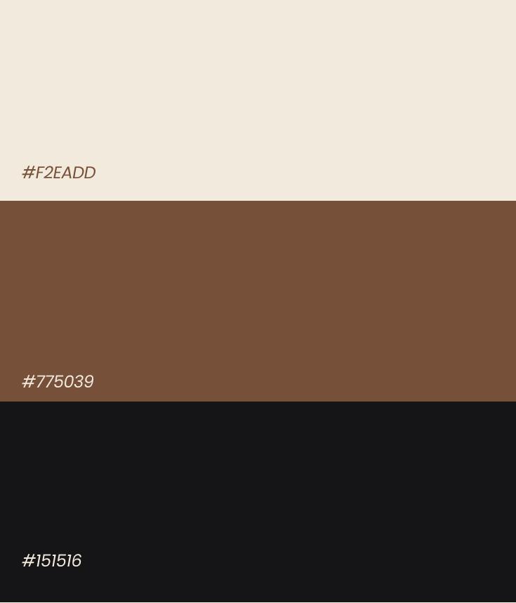
Three colours do all the work: a soft cream, a rich chestnut and a near-black charcoal.
The palette is deliberately small. Cream creates breathing room and keeps layouts light, chestnut gives the brand its warmth and character, and charcoal supplies contrast and a modern editorial edge.
A soft brown gradient built from the same two tones is used for covers, backdrops and social canvases, giving the brand depth without adding a fourth colour.
Cream
#F2EADDPrimary background, reversed type and the logomark on chestnut.
Chestnut
#775039Core brand colour for type, the mark, covers and print.
Charcoal
#151516High-contrast grounds, body copy and editorial layouts.

Bold voice, quiet detail
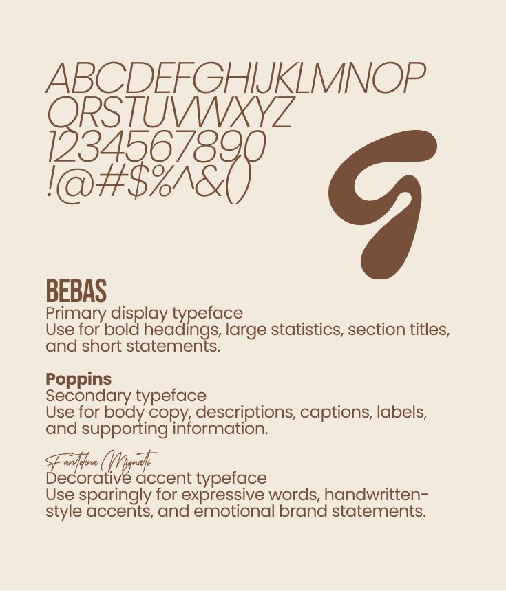
Bebas gives the brand its confident headline voice, Poppins keeps information clear and Fontellina adds a human touch.
Typography is split by role. Bebas is the primary display face for bold headings, large statistics, section titles and short statements. Its condensed proportions let the brand say a lot in a small space.
Poppins carries body copy, descriptions, captions and labels, with generous line height to keep long-form text comfortable. Fontellina Migenta is reserved for expressive words, handwritten-style accents and emotional brand statements, used sparingly so it never becomes decoration.
Display headline
Bebas for campaign statements and section openers.
Subheading
Bebas or Poppins for supporting headlines and stats.
Body copy
Poppins for paragraphs, descriptions and captions.
Accent
Fontellina Migenta for short emotional accents only.
The mark as texture
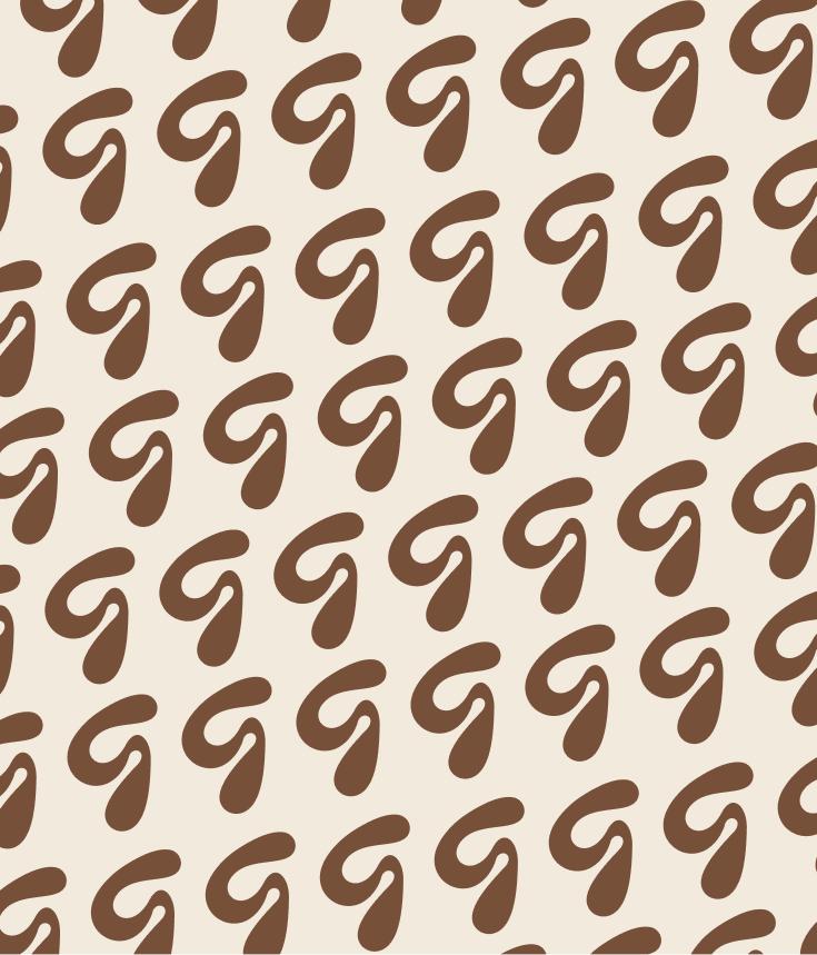
Instead of inventing a decorative motif, the identity repeats the logomark itself.
The brand pattern tiles the mark at a consistent scale and rhythm, turning a single logo into a flexible surface treatment. It works as a full background, a packaging wrap or a quiet band inside a layout.
On photography, the mark is always placed as a cream overlay in a calm area of the frame. It should feel like a signature on the image, never a sticker on top of a face.

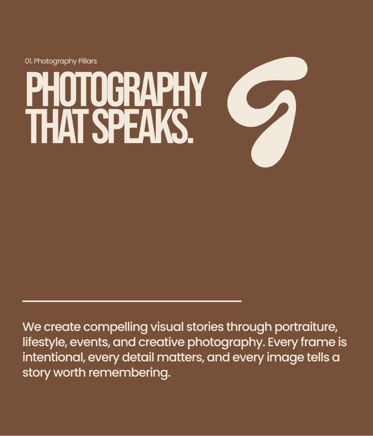
Photography that speaks
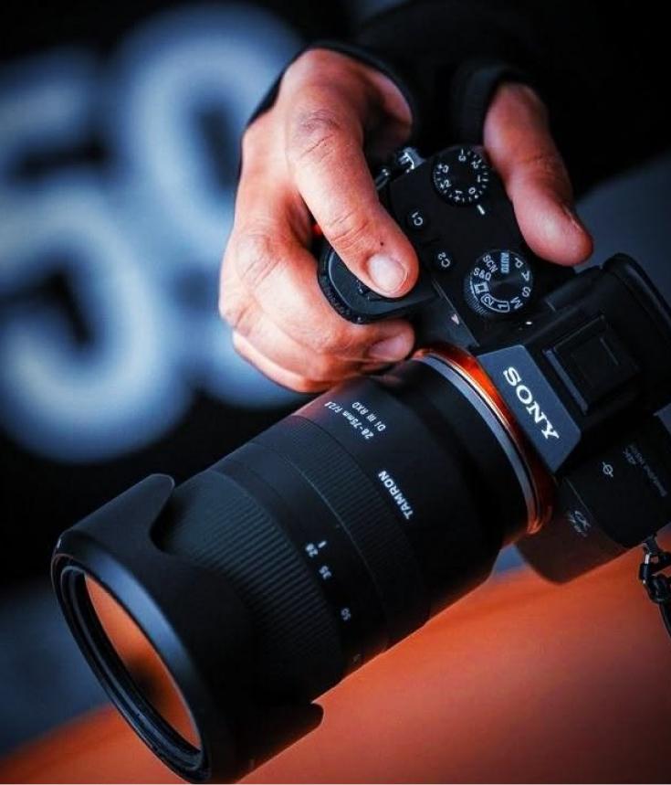
Portraiture, lifestyle, events and creative work, all framed with the same intentionality.
The identity sets a clear photography direction: warm skin tones, soft directional light and compositions that leave room for the subject to breathe. Editing stays natural and filmic rather than overly processed.
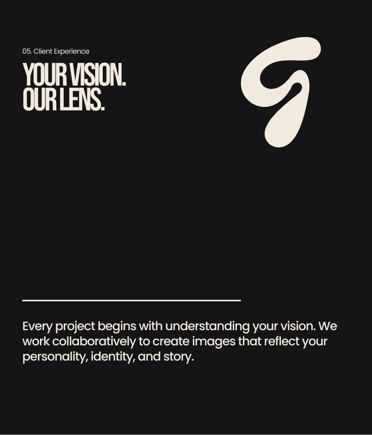
Every frame should feel like it was made on purpose. The guideline pairs this with a consistent studio aesthetic and a simple promise to clients: your vision, our lens.
Photography pillars
- Portraiture: intimate, confident and softly lit.
- Lifestyle: candid moments with a calm, editorial eye.
- Events: story-first coverage that protects the atmosphere.
- Creative: bold concepts carried by careful composition.


The identity in the world
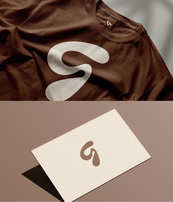
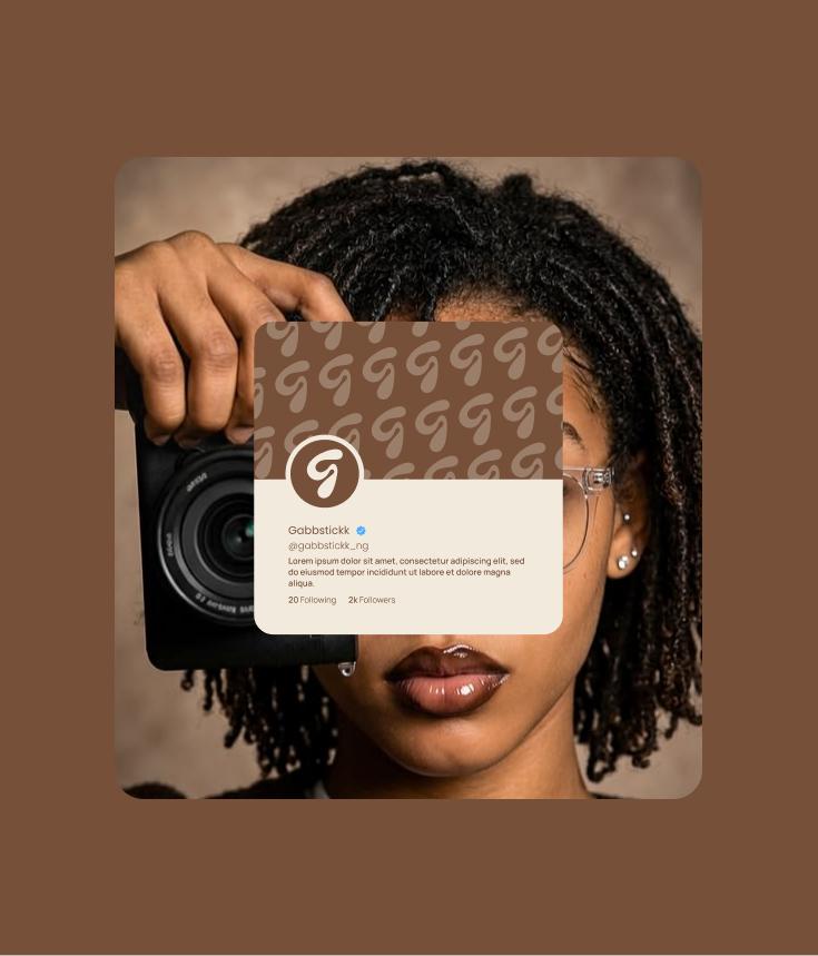
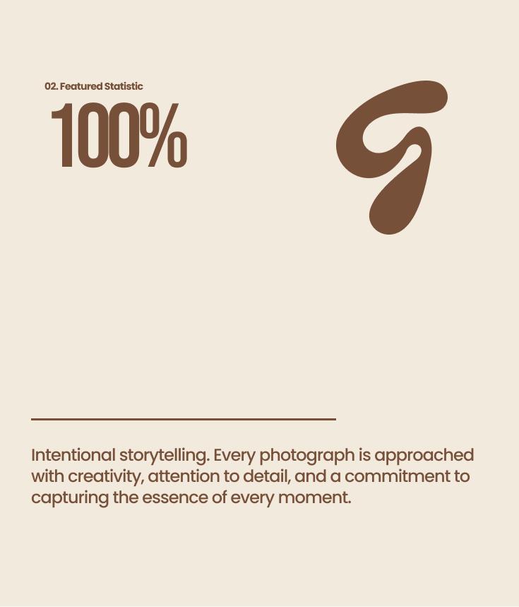
From a t-shirt and business card to a social profile and a closing slide, the system stays recognisably Gabbstickk.
Applications are where a guideline proves itself. Apparel carries the mark large on chestnut, stationery keeps it small on cream, and social profiles use the mark in a tight circular crop so it is legible at avatar size.
Campaign layouts pair big Bebas statements with a single supporting line and plenty of space. The same structure holds for statistics, process explainers and client-experience pages, which keeps the brand consistent as the studio grows.
Next step
Have a similar project in mind?
Tell me what you’re building and I’ll help you shape the next step.