Illustration case study by Victor Omolasoye, Illustrator / Visual Designer —
Flat Vector & Geometric Illustration
An illustration case study
Illustrator / Visual Designer
2026
Project overview
A personal series of vector illustrations built from flat colour and simple geometry. Portraits, animals, everyday scenes and pattern work are reduced to their most recognisable shapes, then given depth through shade, light and confident cropping.
11
Illustrations
Self-initiated pieces in the series
Flat & Geometric
Style
Limited palette, shape-built forms, bold crops
The problem
Most of my work is systems and interfaces, where every decision has to survive a handoff. I wanted a practice that worked the opposite way: fast, expressive, and judged only on whether the image lands in the first second. The challenge was building a consistent visual language without repeating myself.
The approach
A single method applied across eleven pieces: find the silhouette, block it in flat shapes, add one light source, then let the composition do the rest. Bold crops and limited palettes keep each illustration readable at thumbnail size while still feeling crafted up close.
Research & process
Approach
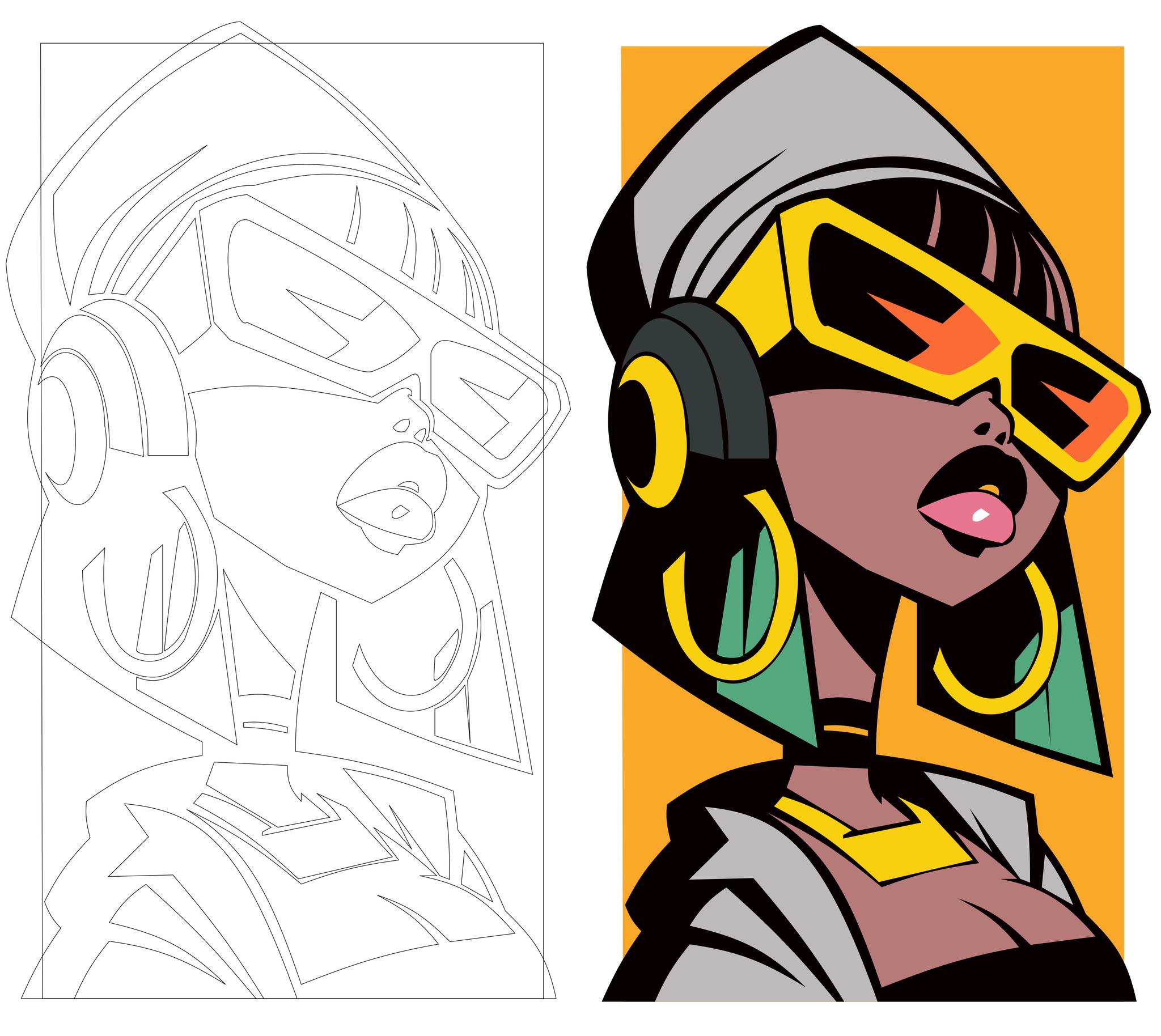
Each piece moves through the same five stages: reference, silhouette study, shape blocking, colour, and a single lighting pass. Keeping the steps fixed made the series feel like one body of work instead of eleven separate experiments — and made it much easier to spot when an image was drifting off-style.
Research
The brief asked for an illustration practice that could scale. Research into the brand visual territory and audience touchpoints shaped the production pipeline: silhouette-first construction, flat colour, character studies and pattern systems.
The work
Shape-First Construction
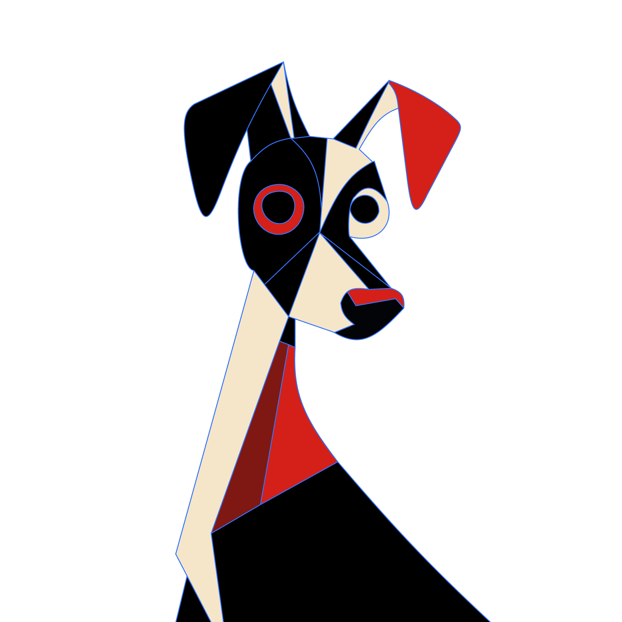
Every subject starts as a silhouette and is rebuilt from overlapping geometric forms before any detail is added.
Flat Colour & Light
Limited palettes with one clear light source — shadow shapes carry the depth instead of gradients or texture.
Character & Animal Studies
Roughly half the series focuses on faces and animals, testing how much can be removed before the subject loses its character.
Editorial Framing
Tight crops and negative space make each piece work as an article visual, social asset or campaign graphic.
Pattern & Abstract Work
Repeatable starburst and wave patterns that push the same flat palette into backgrounds, covers and campaign surfaces.
Selected work









The system
Illustration System Architecture
The illustration practice was architected around a repeatable production pipeline: silhouette-first construction, flat colour and light, character studies, editorial framing and repeatable patterns.
What shaped the work
- Silhouette-first construction before detail
- Flat colour with light carrying depth
- Character and animal studies
- Editorial framing and pattern systems
Inside the work
Constraints
Two rules did most of the heavy lifting. No more than five colours per piece, and every form had to be buildable with the pen tool and a handful of circles. Constraints forced cleaner decisions than any amount of detail would have.
Reflection & impact
Takeaway
Illustration makes me a better interface designer. Deciding what to remove — from a face, a scene, or a screen — is the same skill in both disciplines, and this series gave me a low-stakes place to practise it weekly.
Next step
Have a similar project in mind?
Tell me what you’re building and I’ll help you shape the next step.