Veyra design case study by Victor Omolasoye, Product Designer / UI Designer / Frontend Developer —
Agency Landing Page — Build Better. Move Faster. Grow Smarter.
Overview
Veyra is a digital design, development, and growth agency that supplies skilled remote teams to businesses and startups. The landing page is engineered around a modern B2B agency layout — strong typographic hierarchy, high-contrast CTA accents, and visual social proof — engineered to move visitors from headline to project inquiry without a single scroll of doubt.
The Problem
Remote-team agencies all sell the same abstract promise: talented people, on demand. Landing pages in this category tend to fail in one of two ways. They either lead with a wall of capability copy that reads like a job description, or they lead with a portfolio grid that says nothing about how the agency actually works. Either way the visitor is left asking the same three questions: who exactly will I be working with, what does working together look like day to day, and how do I start without a complicated commitment? Veyra needed a single page that answers all three in order, and turns a browsing visit into a project inquiry.
The Solution
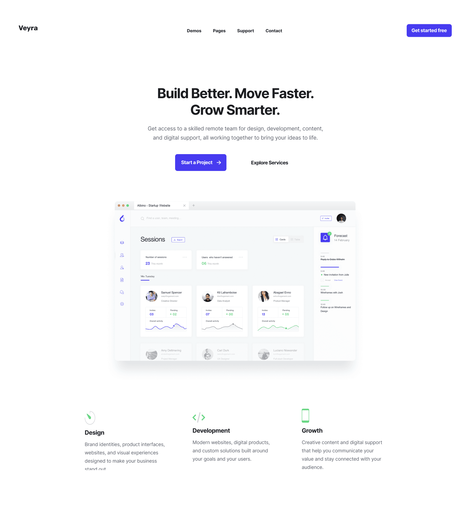
A structured single-page narrative that moves from promise to proof to action. The hero leads with a three-beat headline — Build Better. Move Faster. Grow Smarter. — followed by a plain-language subheadline and a dual-action CTA pairing a high-contrast primary button with a low-commitment secondary link. A dashboard-style hero visual anchors the agency in product and software design rather than abstract marketing. Below it, three service pillars (Design, Development, Growth) state the offering in one line each, a collaged headshot wall proves the team is real, a 2x2 grid of operational promises removes buying risk, a dark-background FAQ section handles the remaining objections, and social proof closes the loop with a flexible-terms banner and three client testimonials before the final conversion block.
Target & Reach
Audience
- Startups & Founders
- SMB Owners
- Marketing Leads
- Product Teams
Regions
- Nigeria
- Global
Key Features
Hero & Value Proposition
A three-beat headline hierarchy — Build Better. Move Faster. Grow Smarter. — paired with a plain-language subheadline, a dual-action CTA group, and a persistent primary button in the header.
Dashboard Hero Visual
An interactive web dashboard preview showing sessions, user activity, team members, and metrics — positioning the agency in software and product design rather than abstract marketing.
Three Service Pillars
Design, Development, and Growth surfaced directly beneath the hero visual with minimal line icons and one-line descriptions of the work each discipline covers.
Team Showcase
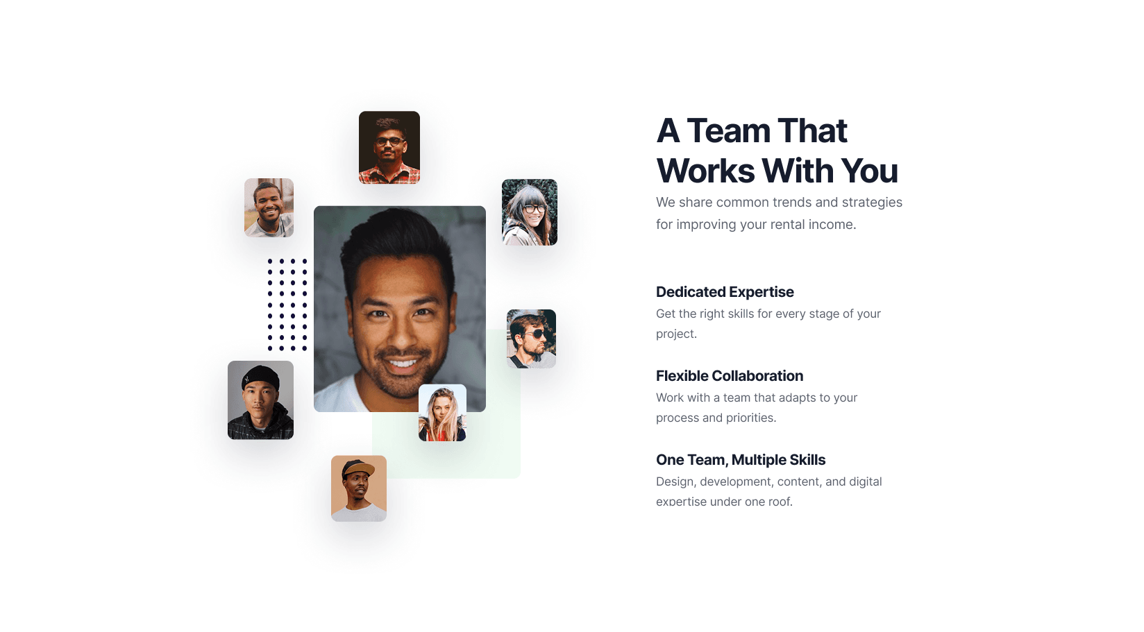
A collaged wall of real headshots arranged around a central focus image under the headline A Team That Works With You, humanising the remote delivery model.
Why Work With Us
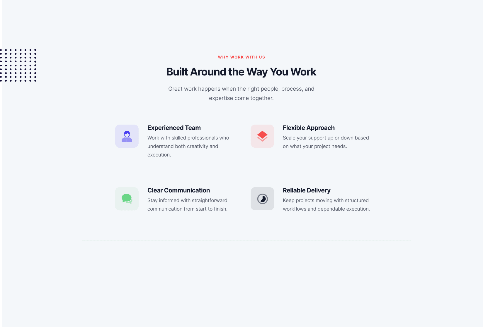
A 2x2 grid built on soft pastel icon containers covering Experienced Team, Flexible Approach, Clear Communication, and Reliable Delivery.
Support & FAQ
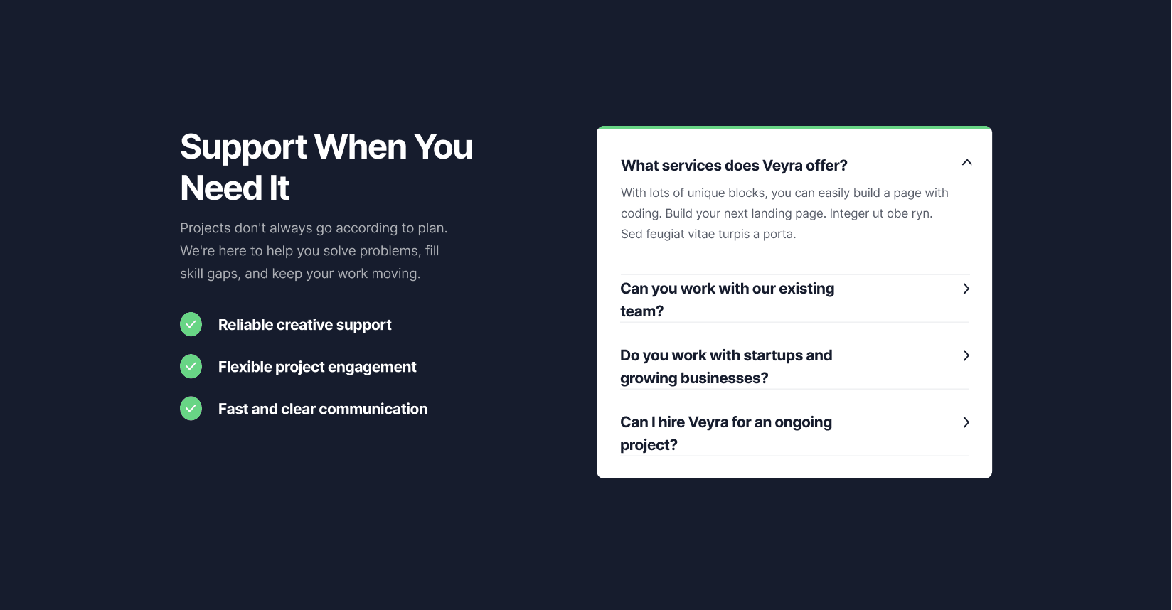
A high-contrast dark section that breaks the page's rhythm, pairing a left-hand value checklist with a right-hand accordion that answers buying objections in place.
Client Social Proof
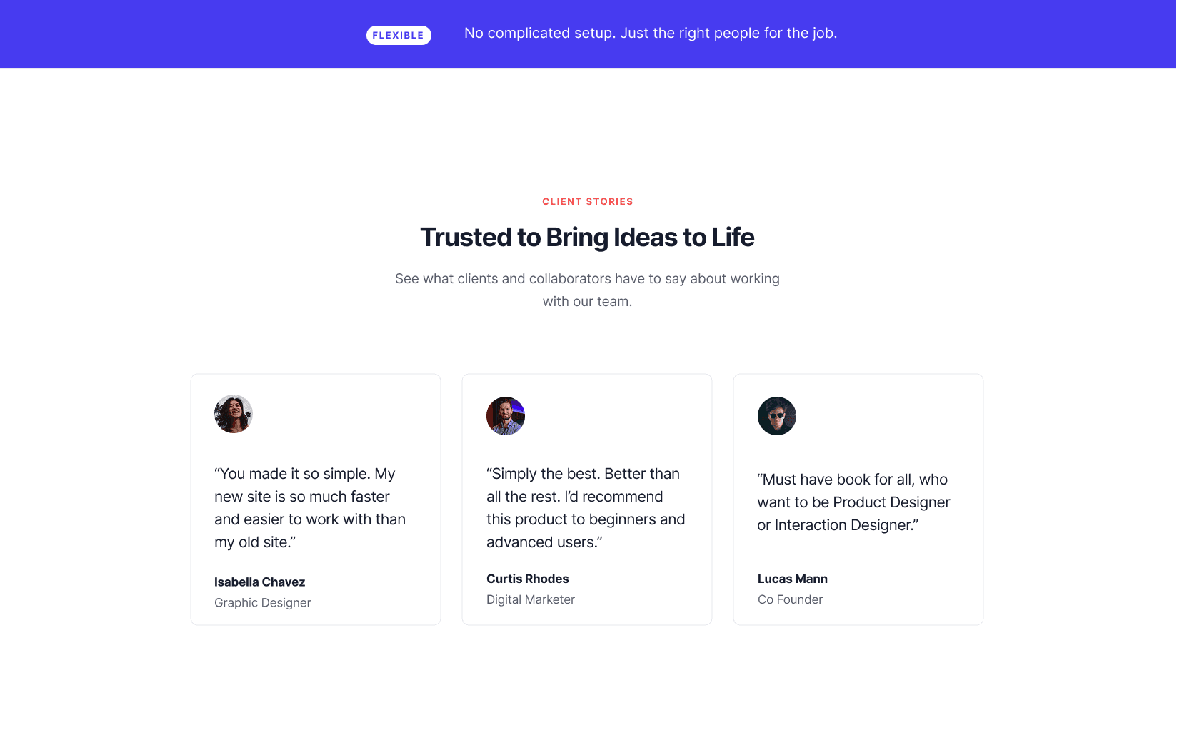
A bright accent-blue banner declaring FLEXIBLE — No complicated setup, followed by a 3-column card grid of testimonials with avatars and roles.
Conversion Banner & Footer
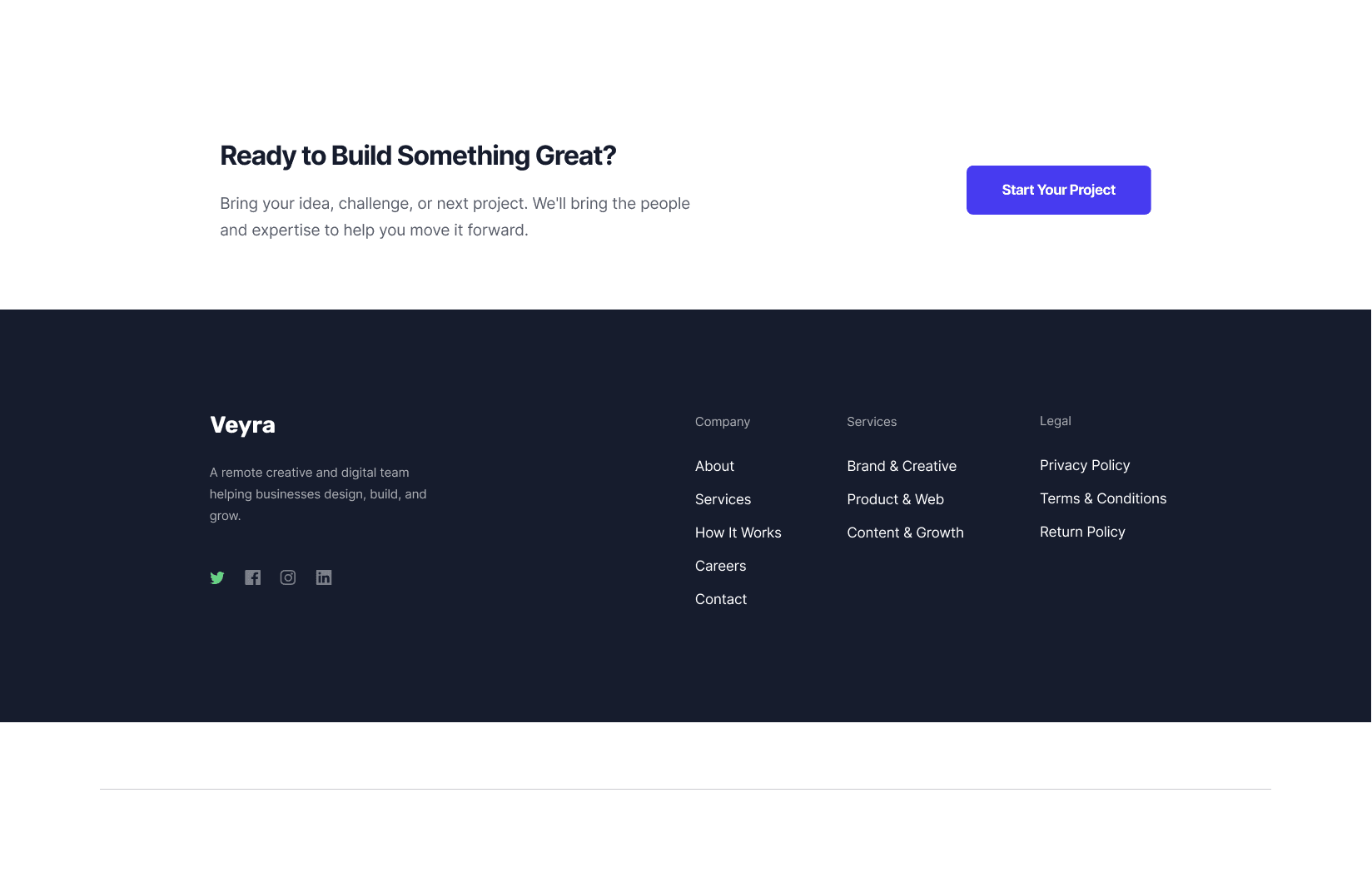
A minimal closing CTA block — Ready to Build Something Great? paired with a Start Your Project button — and a dark footer organising Company, Services, and Legal links alongside social icons.
Technology Stack
Architecture
Scroll-Driven Section Narrative
The page is structured as a single scrolling narrative rather than a set of independent blocks. Each section answers the next question a visitor is asking, so a cold reader is carried from headline to inquiry without needing a separate nav route. Background tone is used as the primary pacing tool — light gray for content sections, deep navy for the FAQ, and bright accent blue for the social proof banner — to create visual rhythm and mark section transitions without extra dividers.
- Three-beat headline hierarchy that compresses the value proposition into one scannable line
- Dual-action CTA pairing a high-contrast primary button with a low-commitment secondary link
- Alternating background tones — light gray, deep navy, and bright blue — to pace a long single page
- Bold lead-ins inside body copy so key values can be skimmed without reading paragraphs
- Real face imagery throughout to humanise an otherwise abstract remote service
Results
4 CTAs
Conversion Focus
Header, hero, mid-page, and closing conversion points
8
Page Sections
Hero through footer, each answering one visitor question
Dashboard UI
Above-Fold Proof
Product-led visual instead of stock agency imagery
Dedicated FAQ
Objection Handling
Dark rhythm-break section with accordion answers
Screens Gallery
Executive Summary
Veyra is a digital design, development, and growth agency providing skilled remote teams for businesses and startups. The landing page is engineered around a modern B2B agency layout, using strong typography, high-contrast CTA accents, and visual social proof to drive project inquiries.
The organising principle was sequence. Every section was mapped to a question the visitor is asking at that exact scroll depth — what can you do, who will I be working with, what does working together look like, what if it goes wrong, and who else has done this — so the page closes objections in the order they surface instead of dumping proof at random.
Hero & Value Proposition
The header stays deliberately uncluttered: top-level links for Demos, Pages, Support, and Contact, paired with a persistent Get started free button that remains available at every scroll depth.
The headline hierarchy does the heavy lifting. Build Better. Move Faster. Grow Smarter. is three beats of three words, which means it survives a one-second glance and still reads as a complete promise on a second read. The subheadline immediately translates it into plain language: access to a skilled remote team for design, development, content, and digital support, all working together to bring ideas to life.
The CTA group is a deliberate pairing — a high-contrast Start a Project button for ready visitors next to an Explore Services link for visitors still orienting. Neither option is a dead end.
The hero visual is an interactive web dashboard preview showing sessions, user activity, team members, and metrics. This is the highest-leverage decision on the page: instead of stock agency photography, the anchor visual is a piece of software, which anchors the agency's capabilities in product and software design before a single word of body copy is read.
Core Service Pillars
Positioned directly beneath the hero visual, three core competencies are highlighted with minimalistic icons and no elaboration:
- Design: Visual experiences, product interfaces, and brand identity
- Development: Modern web solutions, digital products, and custom code architecture
- Growth: Creative content strategies and digital audience engagement
Placing these immediately under the dashboard keeps the offer adjacent to the proof. The visitor sees the work, then immediately sees what disciplines produced it — no scrolling required to connect the two.
A Team That Works With You
The team showcase exists to build human trust and warmth. Real headshots are collaged around a central focus image, with the copy A Team That Works With You leading the section. Highlights underneath reinforce dedicated expertise, flexible collaboration, and unified skill sets.
This is the section that de-risks the whole page. Remote agency services carry an invisible objection — who am I actually talking to — and a wall of real faces answers it faster than any testimonial can.
Why Work With Us
A 2x2 grid layout using soft pastel icon containers establishes operational clarity. Four focus points carry the section:
- Experienced Team
- Flexible Approach
- Clear Communication
- Reliable Delivery
The pastel containers are a deliberate contrast to the high-contrast CTAs elsewhere — this section should read as calm reassurance, not as a second conversion push.
Support & FAQ
A high-contrast dark background introduces visual rhythm change at the exact point the page would otherwise start to feel long. The left-hand value checklist answers why contact support, while the right-hand accordion handles the specific buying objections in place — so a hesitant visitor can resolve a doubt without scrolling back up or leaving the page.
Handling objections where they appear is more effective than a single FAQ block at the foot of the page, because the question is still top of mind.
Client Social Proof
The section opens with a top blue banner highlight — FLEXIBLE: No complicated setup. — which attacks the single biggest barrier to buying a remote team: the perceived commitment and setup overhead. The accent blue is the brightest element on the page and is spent deliberately on the one message that unblocks the decision.
Below it, a 3-column card design presents client testimonials with avatars and roles, borrowing authority from recognisable job titles — Graphic Designer, Digital Marketer, Co Founder — rather than abstract praise.
Conversion & Footer
The page closes with a minimal CTA block built around one clear conversion hook: Ready to Build Something Great? paired with the Start Your Project action.
The footer returns to dark mode and organises navigation into logical columns — Company, Services, Legal — alongside social icons for Twitter, Facebook, Instagram, and LinkedIn, plus a short mission tagline that closes on the agency's reason for existing rather than another sales pitch.
Design Strengths
- Clear Visual Rhythm: Alternating background tones — light gray, deep dark navy, and bright accent blue — keep scrolling engaging across long page sections
- Scannable Information Hierarchy: Bold lead-ins for key points let visitors digest core values quickly without reading heavy blocks of body copy
- Humanized Agency Angle: Real face imagery humanises the service delivery model, reassuring clients about who they will be collaborating with
Growth Opportunities
- Differentiate Hero CTAs: The header button reads Get started free while the hero CTA reads Start a Project — aligning these terms would reduce cognitive load and reinforce one consistent action
- Enhance Testimonial Content: Adding company logos alongside client titles would further strengthen business authority, giving each testimonial an organisational stamp rather than a personal one only
Both recommendations target the same underlying principle as the rest of the page: every element should reduce the number of decisions a visitor has to make before reaching out.