Payvo design case study by Victor Omolasoye, Product Designer (UX/UI) —
Project Coming Soon
Overview
Payvo is a mobile wallet for Nigerian users, designed for iOS and Android. People can add money, send and request payments, pay bills, manage cards and follow every transaction in one app. The case study is coming soon.
The Problem
Everyday money tasks are scattered. People send money in one app, buy electricity or airtime in another, and manage their card somewhere else. Each place reports success and failure differently, so it is often unclear whether a payment actually went through.
The Solution
A single mobile wallet that brings add money, send and request payments, bill payments, card management and full transaction history into one app across iOS and Android. The design shows the balance and recent activity at a glance, puts the most common tasks within two taps, makes every payment outcome unmistakable, and gives people direct control over their cards and PIN.
Target & Reach
Audience
- Nigerian Consumers
- Everyday Bill Payers
- Frequent Money Movers
- Card Managers
Regions
- Nigeria
Key Features
Welcome
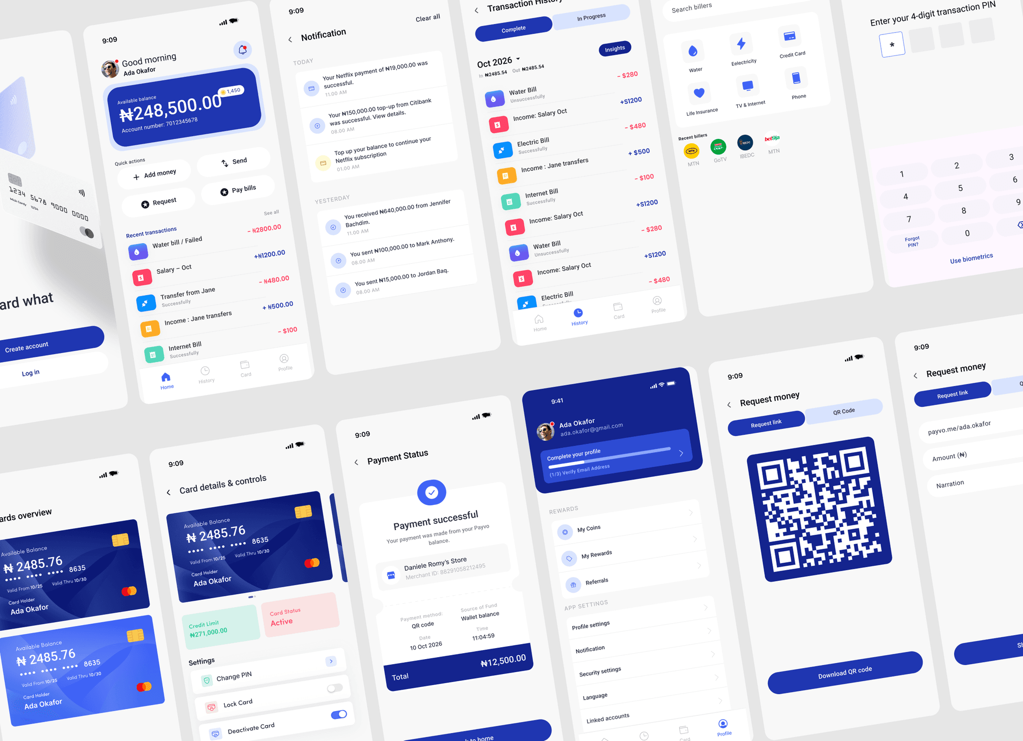
The first screen has one message, “Save toward what matters.”, and two clear paths: Create account and Log in. The 3D card illustration signals what the app is about before anyone reads a word.
Home
The balance comes first, with the account number underneath so it can be shared without leaving the screen. Four quick actions follow: Add money, Send, Request and Pay bills. Below them, recent transactions show a title, a status line and a signed, colour-coded amount (+₦1,200.00 and −₦280.00), so people can scan their activity in seconds.
Notifications
Alerts are grouped into Today and Yesterday, with a Clear all action. Each message says what happened in one sentence, for example “Your ₦150,000.00 top-up from Citibank was successful. View details.” Money received, money sent and top-up prompts all follow the same pattern.
Transaction history
Tabs separate Completed from In progress transactions. A month selector sits beside the money in and money out totals, and two actions are always visible: Insights and Download statement. Every row uses the same status labels as the home screen.
Cards overview
Each card shows its available balance, masked number, validity dates and card holder. A prominent Create new card button sits at the bottom, so adding another card is never buried.
Card details and controls
Credit limit and card status appear as two plain tiles. Below them, Change PIN, Lock card and Deactivate card are separate rows with toggles where the action is reversible. Keeping them apart reduces the chance of tapping the wrong one.
Request money: link
People can request payment through a shareable link (payvo.me/ada.okafor), with Amount and Narration fields. Share link is the single primary action.
Request money: QR code
A segmented control switches to a QR code that someone can scan to pay in person. The primary action changes to Download QR code.
Transaction PIN
Every payment is protected by a four-digit PIN on a large numeric keypad. Forgot PIN? and Use biometrics are available for people who need a different route.
Payment status
The final screen works as a receipt. It confirms “Payment successful”, then lists the merchant, payment method, source of funds, date, time and a bold total. Back to home returns people to where they started.
Bills
A search field leads, followed by bill categories such as airtime, data, electricity, cable TV, internet and water. Recent billers sit underneath, so a repeat payment takes a single tap.
Profile
A profile-completion prompt (“Step 1 of 3: Verify your email address”) encourages people to finish setup. Rewards (My coins, My rewards, Referrals) and app settings (Profile settings, Notification, Security settings, Language, Linked accounts) are grouped under clear headings.
Technology Stack
Architecture
A Consistent Content System Across All 12 Screens
When I audited the 12 screens, I found mixed currencies, inconsistent capitalisation, three time formats and status labels like “Unsuccessfully”. In a payments product, small inconsistencies make people doubt the numbers, so I set five rules and applied them to every screen.
- Currency: naira everywhere, formatted ₦1,200.00
- Signs: money in is +₦, money out is −₦
- Case: sentence case for titles, buttons and labels (“Pay bills”, “Lock card”)
- Status: only Successful, Pending or Failed
- Time and date: 11:00 AM and 10 Oct 2026
Results
12
Core Screens
Welcome through to payment status and profile
[Add value]
[ADD RESULT — Task Success Rate]
Replace with the usability-test task success rate
[Add value]
[ADD RESULT — Time to Complete a Bill Payment]
Replace with the benchmarked time from testing
Screens Gallery
Goals
- Show the balance and recent activity at a glance.
- Put the most common tasks within two taps.
- Make every payment outcome unmistakable.
- Give people control over their cards and PIN.
Research & Discovery
[ADD YOUR RESEARCH: interviews, survey results or competitor audit.]
Outcome
The result is a coherent set of 12 mobile screens and a content system the team can reuse.
[ADD RESULT: for example, task success rate in usability testing] [ADD RESULT: for example, time to complete a bill payment]
Reflection & Next Steps
Content is part of the interface. The most visible improvements here were not layout changes but one currency, one status vocabulary and one capitalisation rule. Next time I would write those rules before drawing the first screen.
If I continued the project, I would: - Usability-test the PIN and payment status flow with first-time users. - Audit contrast and text sizes against accessibility guidelines. - Add a dark theme and a full set of empty, loading and error states.