Stride case study by Victor Omolasoye, Product Designer (UX/UI) —
Workout Tracking App - UX Case Study
Start in seconds. Show up daily.
Product Designer (UX/UI)
2026
Summary
Stride is a mobile workout tracker that helps people build routines, start sessions fast, and stay consistent through a streak-based home screen. The product covers onboarding states, habit-forming feedback, and a scalable component system across the Home and Workouts tabs.
Platform
iOS mobile
Scope
Home and Workouts tabs, including empty and populated states
Tools
Figma
Type
End-to-end product design
Deliverables
Four annotated screens and this style guide
Screens
4 screens across 2 tabs
4
Core screens
Two tabs, each shown empty and populated
2
Tab scope
Home and Workouts designed end to end
1
Primary action
One clear call to action per empty state
8pt
Layout grid
Spacing, padding and gaps
The Problem
Many fitness apps lose people in the first week. Setup feels heavy: before a beginner can do anything, they face a blank app and have to build a plan from scratch. Progress is also invisible: without quick feedback, there is little reason to come back tomorrow.
Two friction points tend to cause it:
Setup feels heavy
Before a beginner can do anything, they face a blank app and have to build a plan from scratch.
Progress is invisible
Without quick feedback, there is little reason to come back tomorrow.
Problem statement
How might we help a first-time user start a workout within seconds, and give them a reason to return the next day?
Goals
- Reduce the time from opening the app to starting a session.
- Make empty states feel like guidance, not dead ends.
- Reinforce consistency with visible, lightweight progress.
- Let people build and reuse their own routines.
Research & Insights
The first-run experience and the return loop were the two moments worth designing for. I compared three established products to see how they handle first launch, quick start and progress display before setting direction.
Competitor audit
Nike Training Club
Strong guided content and a confident first-run path. The catalogue is the product, so starting is easy but returning to a self-built routine is not the focus.
Strava
Progress is cumulative and social. Streaks and weekly totals motivate, but the depth suits committed athletes more than first-week beginners.
Hevy
Fast logging and a reusable routine library. The closest match to the problem: repeat a session without rebuilding it.
Key insights
- Beginners want to start now and organise later, so a persistent Quick start action matters.
- A streak is a simple, proven motivator, but it must be readable at a glance.
- Users returning daily want to repeat past workouts, not rebuild them.
Design Principles
Start fast
The primary action is always one tap away.
Guide, don't block
Empty states point to the next step instead of stopping the user.
Show progress early
Small wins appear on the first screen, not buried in a history tab.
Stay calm and focused
One brand colour, generous spacing and few competing actions.
Solution Walkthrough
Four screens cover the two most important moments in the product: arriving for the first time, and returning once a habit starts to form. Each tab is designed in both its empty and populated state so the system holds together before any data exists.
Each screen is shown with the decision that shaped it and the changes made between drafts, so the reasoning stays attached to the interface it produced.
Screen reference
- Screen 1HomeEmpty (first-time user)
- Screen 2HomeActive (streak and weekly stats)
- Screen 3WorkoutsEmpty
- Screen 4WorkoutsPopulated (saved routines)
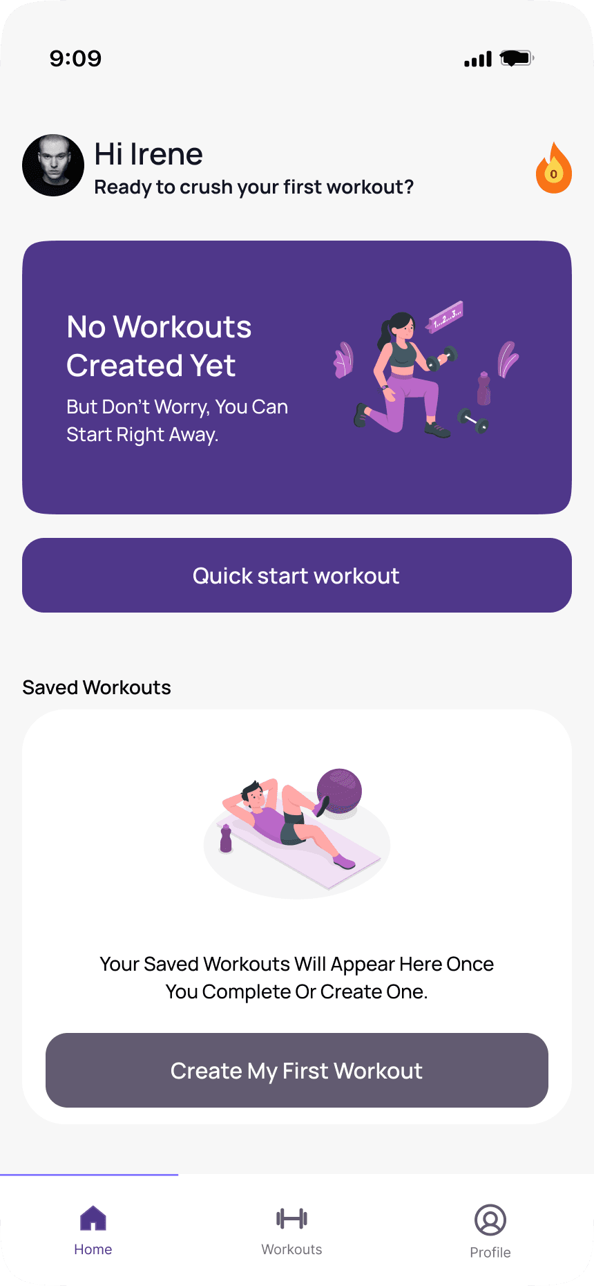
Screen 1 / Home / Empty (first-time user)
A first screen that points forward.
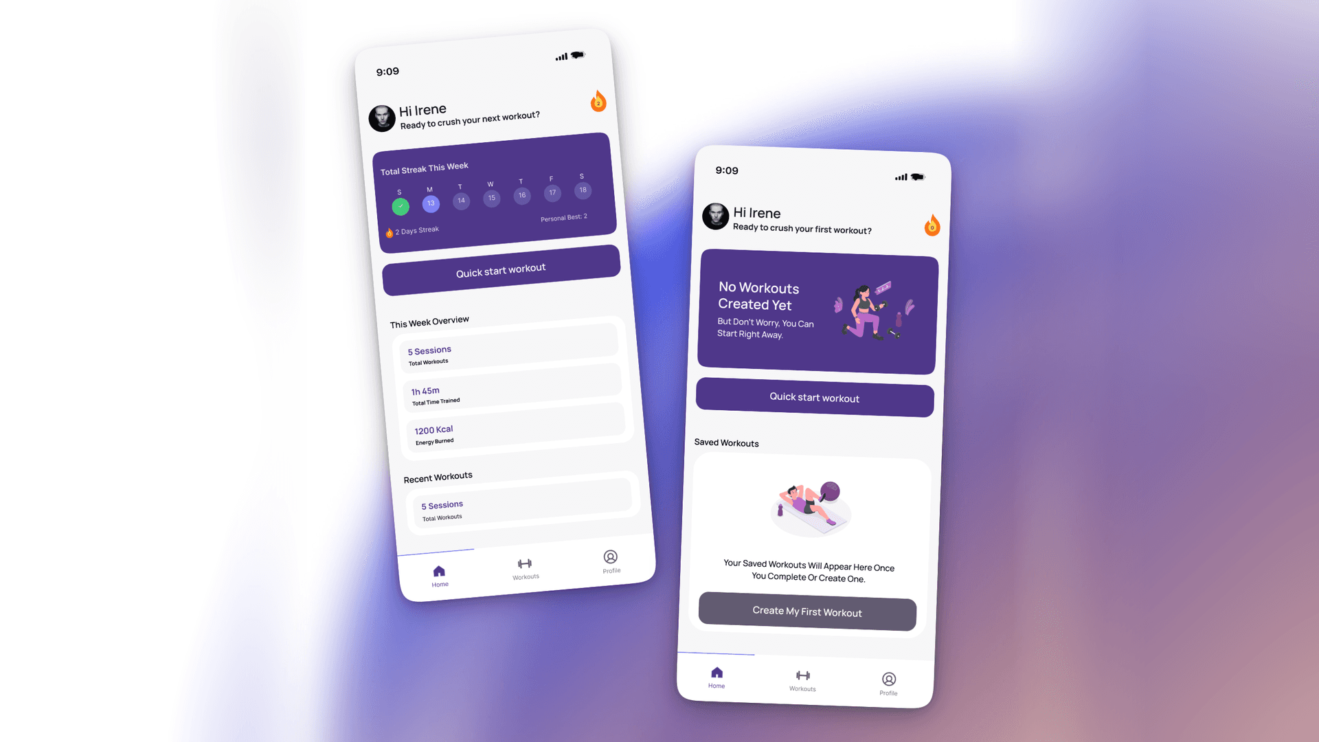
The first-time experience replaces the usual blank home with a hero card: an encouraging message and an illustration on the brand purple. Quick start workout sits directly beneath it as the primary action, while a flame counter in the top right begins at zero.
Below, Saved workouts explains where routines will live, so the space below the fold has a purpose from the first launch.
Design decision
Quick start sits above the fold, so a new user can begin without creating anything first. Saved workouts below gives routines a home, so the space under the primary action still has a purpose.
Iteration notes
- Gave the first screen one job: start a workout. Quick start sits directly beneath the hero card.
- Moved the saved workouts area below the primary action, so planning never delays the first session.
- Introduced the streak counter at zero on first launch, with a tooltip that names the mechanic before it is earned.
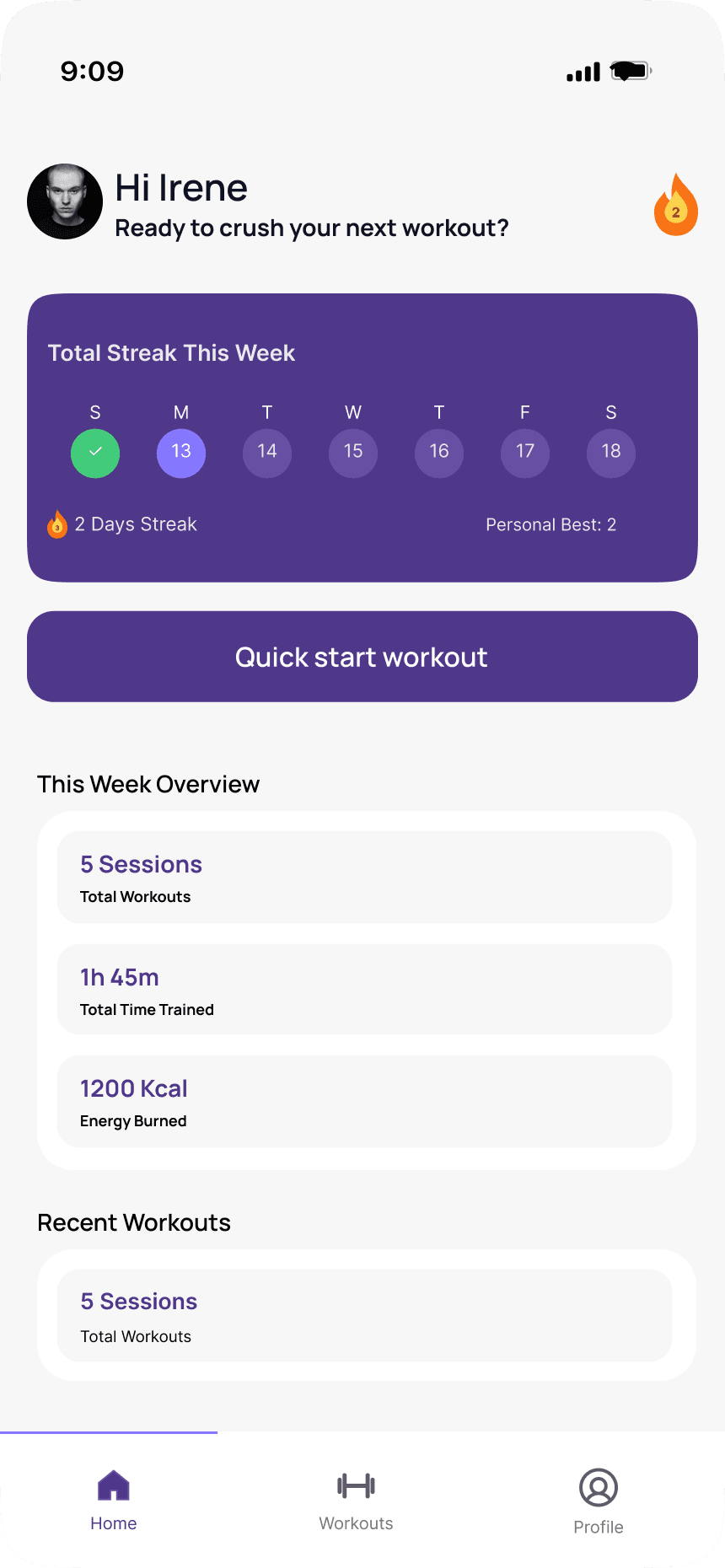
Screen 2 / Home / Active (streak and weekly stats)
Progress you can read in one glance.
Once the user has trained, the hero card becomes a weekly streak tracker. Day circles show completed days with a green check, today highlighted, and the days still to come.
This week overview summarises sessions, total time and energy burned. Recent workouts sits below it, giving past routines a place to resurface without leaving the home screen.
Design decision
Progress is shown as a week at a glance, not a long history. It keeps the screen light while still rewarding consistency.
Iteration notes
- Set the week to start on Sunday so the day labels and the streak logic agree.
- Corrected the streak data so the current streak never exceeds the personal best.
- Raised the contrast of inactive day circles against the purple card.
- Increased caption text to a readable minimum size.
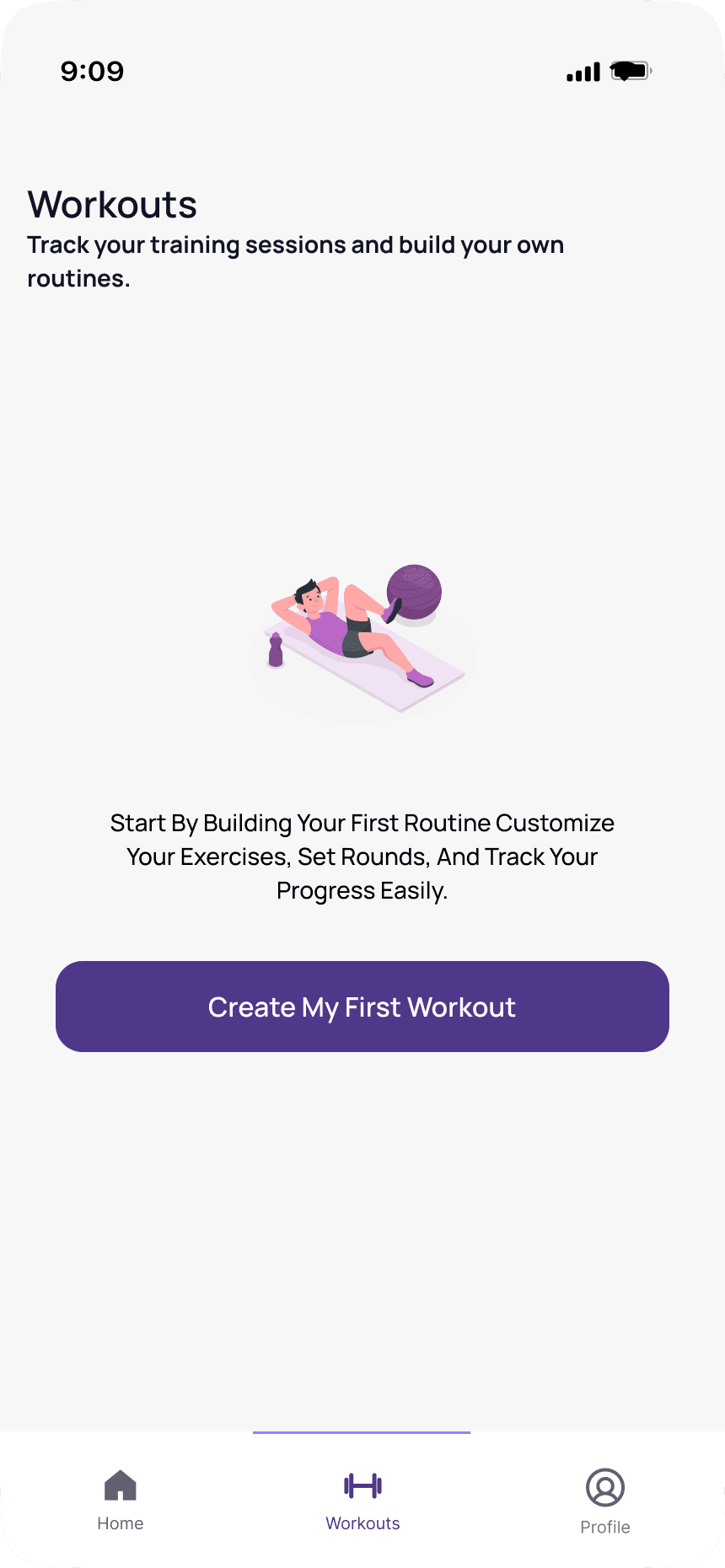
Screen 3 / Workouts / Empty
One screen, one next step.
The Workouts tab for a user with no routines: a single illustration, a short explanation and one primary button, Create my first workout.
Design decision
One action only. Everything on this screen exists to push the user toward creating a routine.
Iteration notes
- Rebalanced the content vertically so the illustration and action sit together instead of floating in empty space.
- Aligned the title position with Screen 4 so both Workouts states share a layout.
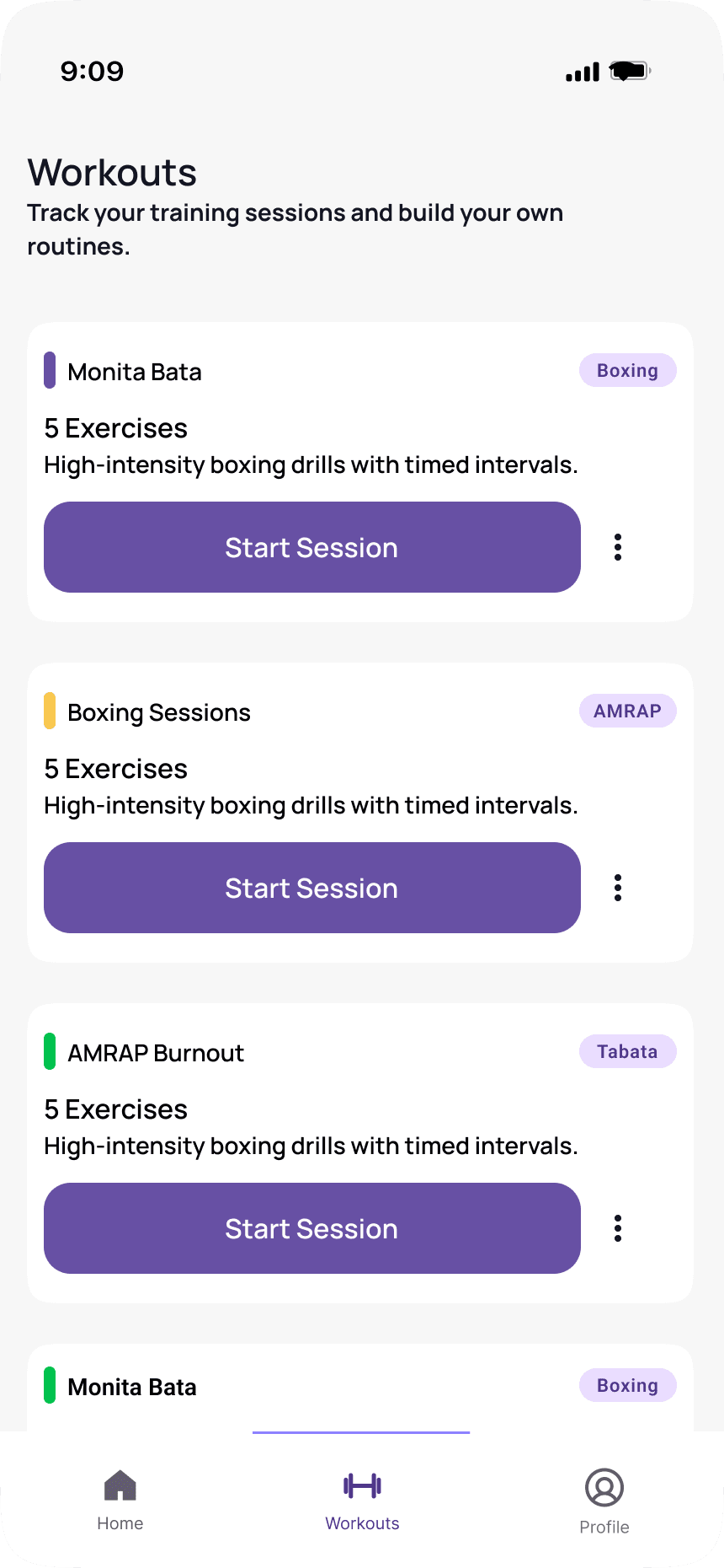
Screen 4 / Workouts / Populated (saved routines)
A routine library built for repeat sessions.
Each card carries a colour marker, workout name, type tag, exercise count, a short description, a Start session button and an overflow menu for edit and delete.
The card keeps starting a session in the foreground while edit and delete stay one level back, so the list stays quiet until someone needs it.
Design decision
Starting a session is the card's main job, so the button is always visible rather than hidden behind a detail page.
Iteration notes
- Mapped the coloured left bar to category so it carries meaning instead of decoration.
- Moved edit and delete behind the overflow menu, keeping the card focused on starting a session.
- Set one card rhythm across the list: name and tag, then exercise count and description, then the action.
Design System
The interface is built from a small set of reusable parts, so all four screens feel like one product. Colour carries meaning, type keeps the hierarchy calm, and the 8pt grid keeps spacing predictable between empty and populated states.
Colour
Deep purple
#4F378ABrand, primary buttons, streak card
Light purple
#EADDFFTags, highlights, selected states
Green
#42CB7BCompleted days and checks
Orange
#F97316Streak flame
Ink
#111111Titles and primary text
Surface
#F7F7F7Screen background
Typography
Title
Screen titles such as Workouts
Section heading
Card titles and section headers
Body
Descriptions and card copy
Caption
Dates, secondary labels and metadata
Label
Tags, tab labels and micro copy
Spacing
An 8pt grid drives margins, padding and gaps. Screen padding is 24pt, card padding is 16 to 20pt, and vertical rhythm steps in multiples of 8.
Components
Navigation
A three-tab bar (Home, Workouts, Profile) with a purple active state and grey inactive icons. Home and Workouts are the designed scope; Profile is shown for completeness.
This page doubles as the style guide: the colour tokens, type scale, spacing rule and component list above are the same ones used across all four screens, so new screens can be assembled without redrawing the basics.
Key Decisions & Trade-offs
Every decision bought clarity in one place and cost something in another. These are the trade-offs worth revisiting as the product grows.
Persistent Quick start button (Screens 1 and 2)
- Why
- The lowest possible barrier to starting
- Trade-off
- Competes with the routine library for attention
Weekly streak instead of a long history (Screen 2)
- Why
- Instant, motivating feedback
- Trade-off
- Less detail for advanced users
One primary call to action per empty state (Screens 1 and 3)
- Why
- A clear next step for beginners
- Trade-off
- Less choice up front
Full-width Start session on every card (Screen 4)
- Why
- An obvious, thumb-friendly action
- Trade-off
- Visually heavy in long lists, so it was refined to a lighter button
Quick start skips routine creation
- Why
- Gets a first session started in seconds
- Trade-off
- The first session is generic rather than personalised
Success Metrics
These are the metrics used to judge whether the first-run flow and the streak loop are working.
- 01
Activation
Percentage of new users who complete a first workout in their first session.
- 02
Time to first workout
Seconds from first launch to starting a session.
- 03
Retention
Day-1 and day-7 return rate.
- 04
Habit
Average streak length and the share of users who start a session from Recent workouts.
- 05
Creation
Percentage of users who save at least one custom routine in week one.
Reflection & Next Steps
What I learned
- Empty states are a real design opportunity, not an afterthought.
- Consistent content and data matter as much as visuals. Mismatched tags and impossible streak numbers weaken an otherwise strong screen.
- Reducing the number of actions on a screen made the primary action clearer.
- A small design system pays off twice: it speeds up empty and populated states, and it exposes inconsistencies early.
Next steps
- 1Design the core loop: in-workout screen, rest timer and session summary.
- 2Build the workout creation flow behind the plus action.
- 3Design the Profile tab and settings.
- 4Run usability tests with five people and iterate on the first-run flow.
- 5Add dark mode and accessibility checks for contrast, text size and touch targets.
The next session is the product.
Every empty state, quick start and streak exists to make that next session easier to begin than the last one.
Next step
Have a similar project in mind?
Tell me what you’re building and I’ll help you shape the next step.